
CTMS Dashboards: KPIs and Metrics for Clinical Trials
Executive Summary
Clinical Trial Management System (CTMS) dashboards have become essential tools for tracking, analyzing, and optimizing the performance of clinical trial operations. By aggregating data from study operations in real-time, these dashboards enable sponsors, CROs, and investigators to monitor Key Performance Indicators (KPIs) and metrics across all phases of a trial. This comprehensive report explores the use of CTMS dashboards in 2026, examining the historical development of trial metrics, the current state of dashboards and KPIs in clinical research, and future directions such as predictive analytics and decentralized trials. We provide extensive data, case studies, and expert analyses on categories of KPIs – including enrollment and recruitment metrics, retention and completion rates, site performance measures, data quality indicators, financial and resource metrics, and regulatory/compliance metrics. We evaluate how leading CTMS platforms present these metrics (e.g. protocol-level and site-level dashboards ([1])) and compare vendor approaches (e.g. Veeva’s built-in real-time dashboards vs. Oracle’s BI integration ([2])). Notable case studies – such as an adaptive “DANE” dashboard for enrollment ([3]) ([4]) and Covance’s lab-based site performance analytics ([5]) ([6]) – demonstrate the practical impact of metric-driven dashboards. We draw on recent research showing, for example, that most trials miss enrollment targets (with ~80% not meeting initial timelines) ([7]), and that trial durations have significantly increased (phase III recruitment rising from ~13 to 18 months over 2008–2019) ([8]). These evidence-based findings underscore the need for robust monitoring. The report concludes with a discussion on the implications of these metrics-driven approaches for stakeholders and future directions in clinical operations, such as AI-powered forecasting, enhanced patient-centric metrics, and evolving regulatory expectations.
Introduction and Background
Clinical trials are complex, resource-intensive endeavors critically dependent on efficient operations and data management ([9]). Over the past two decades, the industry has moved from paper-based study logs to sophisticated enterprise Clinical Trial Management Systems (CTMS) that centralize study planning, conduct, and oversight. Modern CTMS platforms claim to “unify data from multiple sources, eliminate siloed spreadsheets/documents, and deliver real-time dashboards of trial metrics” ([10]). Indeed, CTMS solutions routinely track study milestones, site statuses, enrollment progress, monitoring visits, issue resolution, and regulatory documentation in one system ([10]). They provide both protocol-level dashboards (summarizing overall study health) and site-level dashboards (drilling into individual site performance) ([1]).
As of 2025, the global CTMS market was already valued at over $2.35 billion and is projected to exceed $7.4 billion by 2033 ([11]). Growth drivers include increasing trial complexity, tighter regulatory emphasis on data integrity, and widespread adoption of remote and decentralized trial methods. Sponsors and CROs are realizing that a modern CTMS is vital for competitive operations. For example, one market analysis notes that regulators increasingly expect “integrated, cloud-based trial management systems” to ensure oversight ([11]). This context highlights the importance of CTMS Dashboards: interactive interfaces that visualize KPI metrics, enabling faster, data-driven decision-making. Well-designed dashboards confront the historical issue that many trials lag on recruitment or compliance because problems are detected late ([7]) ([8]). By bringing metrics into focus, CTMS dashboards aim to turn “metrics to meaning” for stakeholders, ensuring better trial performance.
Definitions: In operational management, a Key Performance Indicator (KPI) is a metric that measures “the critical functions and activities that must be performed in an organization to provide management with an assessment of quantity and quality” ([12]). In clinical research, KPIs are operational metrics that indicate study health – for example, rates of patient enrollment, data query resolution times, or protocol deviation counts. These are distinguished from ad-hoc metrics by being directly tied to strategic objectives (e.g. enrolling 100% of planned patients by a target date) and by being tracked continually. As one expert notes, KPIs act as “flags” or “alerts” to signal success or problems, allowing teams to pivot and improve performance ([12]).
This report provides a thorough analysis of CTMS dashboards, KPIs, and metrics in clinical trial operations. We begin by reviewing the evolution and role of dashboards in trial management. We then delve into major categories of KPIs (enrollment, retention, site performance, data quality, etc.), supported by data and literature. Practical considerations – such as data integration and dashboard design – are examined, along with case studies of real-world implementations. Finally, we discuss future directions, including AI enhancements and the implications of a more decentralized clinical trial landscape. Throughout, all claims are backed by current research and industry sources.
The Role of Dashboards in Clinical Trial Management
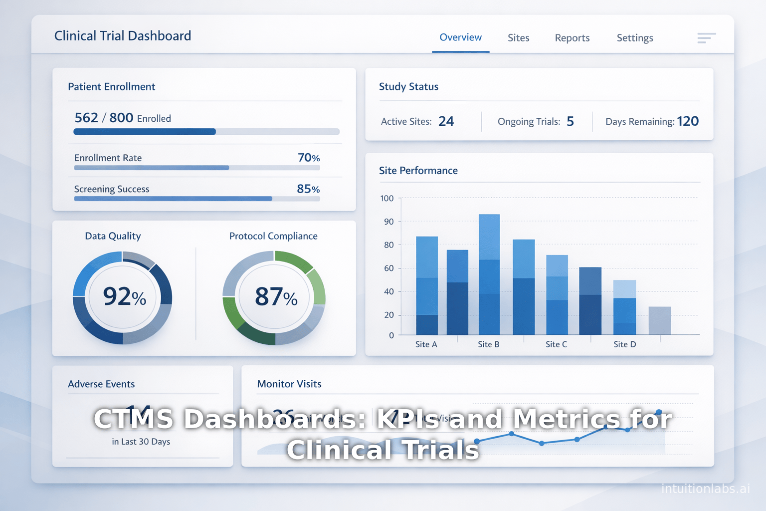
CTMS dashboards serve as centralized control panels for trial operations, summarizing complex data into clear visualizations. They allow users to monitor trial progress, site performance, data quality, safety, and financial status at a glance. Typically, a CTMS dashboard pulls data from the system’s underlying modules (e.g. enrollment logs, monitoring visit reports, financial ledgers) and often integrates with other systems like EDC (Electronic Data Capture) or eTMF (electronic Trial Master File).
For example, Oracle’s CTMS documentation describes two standard dashboard views: a Protocol Dashboard and a Site Dashboard ([1]). The Protocol-level dashboard aggregates key information for the entire study – including overall enrollment numbers, site activation statuses, subject visit completions, payment statuses, and the status of monitoring activities ([1]). In contrast, a Site-level dashboard zeroes in on a single investigative site, showing metrics like the number of subjects enrolled at that site, visit completion rates, query resolution status, and overdue payments ([1]).In practice, sponsors use protocol dashboards in executive reviews to gauge overall trial health, while site dashboards help project managers and coordinators troubleshoot specific site issues.
The ultimate goal of a dashboard is to provide timely, actionable information. One study developed an Excel-based dashboard with control charts specifically for recruitment monitoring ([3]). It provided “timely, actionable, and unbiased information on the count of participants who have completed each stage” of the recruitment process ([3]). By visualizing accrual counts and weekly trends, the team could quickly identify enrollment bottlenecks and adjust strategies. In general, dashboards turn raw operational data into insights: for instance, a spike in screen failures at Site A or a drop in eCRF entry at Site B becomes immediately visible on a dashboard chart.
Dashboard technology has matured. Today’s CTMS vendors often tout real-time analytics and visualization. Veeva Vault CTMS, for example, integrates directly with Veeva Vault EDC so that enrollment entries flow immediately into CTMS charts ([2]). External business intelligence tools can also be connected: Medidata Rave CTMS can feed data into advanced BI modules, and Oracle CTMS often integrates with Oracle BI/Analytics solutions ([2]). This reflects a broader industry shift: no longer do teams rely on static Excel status reports; instead, interconnected dashboards provide up-to-the-minute KPIs across the trial lifecycle ([10]).
In the remainder of this report, we examine which KPIs and metrics are critical to display on these dashboards, why they matter, and how they are calculated. We ground the discussion in evidence: for instance, we will see that ~80% of trials historically fail to meet enrollment targets ([7]), which motivates real-time tracking of enrollment rates. Similarly, the substantial cost (up to $8 million per day) of delays ([7]) means that identifying long lead times via dashboards can quickly translate into risk mitigation. By the end, readers will have a deep understanding of how dashboards and KPIs form the backbone of modern clinical trial performance management.
Categories of KPIs and Metrics for Clinical Trials
Clinical trial KPIs span many dimensions of study operations. For clarity, we organize them into broad categories. Each category comprises specific metrics that reflect trial health in that domain. Table 1 below summarizes key KPI categories along with example metrics and their purposes.
| KPI Category | Example Metrics | Purpose / Implications |
|---|---|---|
| Enrollment & Recruitment | Number of patients screened; number enrolled per week; Enrollment rate (actual vs. target); Screen failure rate; Enrollment timeline (e.g., median days to 80% target) ([8]) ([7]). | Track whether accrual is on schedule; identify sites or regions falling behind; adjust recruitment strategies to prevent delays (80% of trials miss enrollment timelines ([7])) |
| Patient Retention & Completion | Retention rate (e.g. % patients staying through last visit); Dropout rate per site; Completion rate of subject visit schedules. | Ensure trial will reach its endpoint; detect protocol tolerability or consent issues; retention is crucial (25% of RCTs discontinue due to poor recruitment/retention ([13])) |
| Site Activation & Performance | Number of sites initiated; Site startup duration (days from IRB approval to first patient visit) ([8]); Enrollment per site; Protocol deviations per site; Visit adherence rate per site. | Evaluate site selection and management; identify high-value sites (e.g. “sites that enroll quickly [and] engage patients” are deemed high quality ([9])); optimize site network and resources |
| Operational Timelines | Time to key milestones: IRB approval, site initiation, first patient in (FPI), last patient out (LPO), database lock; median and variance of cycle times. | Gauge overall study speed and identify bottlenecks; delays in these steps (e.g. rising from ~13 to 18 months recruitment ([8])) directly impact cost and drug development timelines |
| Data Management & Quality | Data entry lag (days since visit to data entered); Query volume (open queries, queries per subject) and resolution time; Error rate in CRFs or database (e.g. errors per 10,000 fields) ([14]); % SDV completed. | Monitor data completeness and cleanliness; slow query resolution or high error rates signal risk to data integrity; in EDC trials, error rates are often low (≈14.3 errors per 10k fields ([14])) but must be tracked; fast click to lock data streamlines analysis |
| Safety & Adverse Events | Number of SAEs and AEs reported vs. expected; reporting delay (days from event to database); Safety signal metrics. | Ensure patient safety and regulatory compliance; track whether safety issues are skewed at certain sites or periods |
| Quality & Compliance | Number of protocol deviations/violations; audit readiness metrics; number of monitoring findings; compliance with monitoring plan (e.g., % visits monitored on schedule). | Maintain GCP standards; KPI thresholds can alert teams when site training or oversight is needed; can tie into Risk-Based Monitoring (RBM) indicators |
| Financial & Resource | Budget burn rate vs. plan; cost per patient/site; remaining budget percent; contract milestone payments status. | Control costs and ensure financial resources are on track; e.g. extended timelines cost ~$600k–8M per day ([7]) so cost KPIs are critical to manage |
| Patient (Stakeholder) Engagement | Patient satisfaction/Net Promoter Score; patient portal usage; number of protocol amendments due to patient feedback. | In patient-centric trials, metrics on engagement (e.g. {%} completion of ePRO surveys) can inform on participant experience |
Table: KPI Categories and Example Metrics for Clinical Trials. High-level categories of KPIs that a CTMS dashboard should cover, with sample metric types and their strategic purpose.
As Table 1 shows, enrollment and retention metrics form a core category. Recruitment shortfalls are the top cause of trial failure – up to 25% of RCTs halt early for poor accrual ([13]). It is therefore standard to track weekly accrual and compare to planned rates. For example, one study’s dashboard tracked the count of patients at each stage of screening-to-consent, enabling investigators to improve enrollment processes ([3]) ([15]). The design of enrollment KPIs will often differ by indication: chronic disease trials may measure monthly enrollment per site, while oncology trials may focus on qualifying screening rates. Recruitment funnel metrics (e.g. screen-to-randomization ratio, percent of target achieved) are also commonly displayed.
Patient retention is another vital category. Metrics include the percentage of enrolled subjects who complete all visits and the site-wise dropout rate. Retention is essential because even with full enrollment, dropouts can skew power and bias results. Dashboards often plot a survival curve of retention or show “number of active subjects” over time. In the JAMIA Open case study, for instance, implementing a real-time recruitment dashboard increased screening rates and reduced overall study completion time by 19 days ([15]), demonstrating that visibility into attrition helps teams intervene (e.g. by re-consenting or adding retention incentives).
Site performance metrics help sponsors understand which sites contribute most (or least). These include speed-of-activation (e.g., days from site selection to first patient visit) ([8]), enrollment totals per site, and quality measures (e.g. average query count per subject). One analytics approach uses historical lab collection data to score sites: investigators who have both high enrollment counts and low screen-failure rates are flagged as “best-performing” ([16]). Consistent with this, Covance demonstrated that integrating central lab metadata allows development of stable site-level performance metrics ([5]). A high-performing site, practically speaking, is one with both rapid enrollment and good retention (as the Covance researchers note ([9]) ([6])). Dashboards can color-code or rank sites by such composite indices to guide site selection in new trials.
Operational timeline metrics (sometimes a category of their own) include cycle times for each trial phase: start-up, enrollment, follow-up, close-out. These are often visualized as Gantt charts or control charts. For example, the DANE trial’s dashboard plotted control charts of weekly accrual ([3]). According to PLoS ONE data, the median recruitment duration in industry phase III trials grew from 13 to 18 months over 2008–2019 ([8]), underscoring why sponsors track planned vs. actual durations in dashboards. Interruptions can be immediately visible: if enrollment in one country stalls, an interactive map or site-list dashboard will highlight it.
Data quality metrics form another important class. Since trial data flows through the CTMS or related systems, dashboards can show metrics like total outstanding queries, average resolution time, and overdue CRF pages. Data management teams often have key issue trackers – e.g. percent queries closed within 5 days, or eCRF item-entry lag (days between visit date and data entry) – and these can be surfaced on dashboards for up-to-date monitoring. While academic research shows that error rates with modern EDC are relatively low (14.3 errors per 10,000 fields ([14])), real-time data quality KPIs ensure standards are maintained. For example, one CTMS might have a gauge showing “90% of pages entered within 2 days” with a green/yellow/red status. Persistent lags would trigger alerts for clinical data managers to follow up with sites.
Safety and compliance KPIs, though sometimes monitored separately, can also appear on CTMS dashboards. For example, the count of Serious Adverse Events (SAEs) reported over time may be plotted to catch safety signals. Compliance metrics such as percentage of monitoring visits completed on schedule, or number of open DevOps issues, signal how well the trial is obeying protocol and regulations. These are crucial both for patient safety and for inspection readiness. By tying safety data from EDC into the CTMS dashboard (or by integrating the dashboards across systems), oversight teams gain unified visibility into whether safety events correlate with operational factors.
Finally, financial and resource KPIs are tracked by sponsors to manage budget. These include overall budget spent to date, cost per enrolled patient, burn rate versus projected, and vendor payment timelines. Although not always part of a standard CTMS dashboard (financials may sit in a separate module), many enterprises overlay budget KPIs onto trial progress charts to quickly see cost variances. Given the massive daily costs of delays (estimated up to $8 million per day) ([7]), financial oversight is often integrated with performance metrics to assess ROI of accelerating operations (for example, calculating the trade-off between additional monitoring visits versus the cost of a delayed submission).
In summary, effective CTMS dashboards cover multiple perspectives: patient-level progress, site-level productivity, study-wide timelines, and resource utilization. By continually measuring and visualizing these metrics, CTMS dashboards make the complex process of trial conduct transparent. The selection of which KPIs to include should align with trial and organizational goals, regulatory priorities, and common pain points (e.g. if enrollment is historically slow, the dashboard should emphasize accrual metrics). As one industry author aptly notes, “If you can measure it, you can improve it” – and in clinical trials, the right metrics charted on a dashboard can guide the team to do precisely that ([12]).
Dashboard Design and Technical Considerations
Implementing a CTMS dashboard involves design choices to ensure data is accurate, timely, and interpretable. Key considerations include data integration, metric definitions, visualization best practices, and user roles/audiences.
Data Integration
A CTMS dashboard can only be as good as its underlying data. Typically, the CTMS itself holds much operational data (e.g. site status, subject enrollment tallies, monitoring visits). However, other systems also generate useful data streams. Many organizations therefore connect the CTMS with:
- EDC Systems: Enrollment confirmations, subject status (screened, randomized, in follow-up), and safety events are often recorded first in the EDC. Modern CTMS solutions may interface directly with EDCs. For instance, Veeva Vault CTMS automatically ingests enrollment events from Veeva EDC ([17]), so that dashboards show up-to-date enrollment without double-data-entry.
- eTMF / Document Repositories: Milestones like IRB approval or site training clearance often come from the TMF system. Dashboards may incorporate these by pulling from eTMF. Oracle CTMS, for example, clearly describes site dashboards showing protocol and subject documents status, and a protocol dashboard listing IRB and regulatory document statuses ([1]).
- Laboratory or Imaging Data: As demonstrated by Covance, central lab data (such as the timing of kit shipments and results) can act as proxies for enrollment activity at sites ([5]). When integrated, lab data can supply “hard” event timestamps to verify site performance metrics.
- Analytics Tools: In some cases, raw CTMS data is fed into advanced analytics or BI tools. While CTMS vendors may have built-in dashboards, organizations sometimes export CTMS data to platforms like Power BI or Tableau to create more customized views. The JAMIA Open case study did exactly this: REDCap data was retrieved into a Power BI dashboard ([18]) for interactive visualization of accrual. The same data from Power BI could be tied back to CTMS user actions.
- Finance Systems: Budget and payment information often resides in a financial database. Integrations can allow a CTMS dashboard to include spend analysis. For example, Veeva Vault CTMS can exchange budget status with enterprise financial planning tools (though this often requires custom integration).
Effective dashboards rely on timely data. Ideally, feeds are automated (via APIs or ETL processes) so that charts refresh daily or even hourly. Establishing one “source of truth” for each KPI metric is crucial – confusion arises if EDC says 50 patients enrolled but CTMS shows 48 due to sync lag. As a clinical project manager noted, all KPI definitions must be clearly documented: e.g. define “activated site” distinctly (does it require SIV completed or first patient enrolled?) ([19]). Without such golden definitions, dashboards across departments can become inconsistent.
Defining and Standardizing Metrics
Dashboards must track well-defined metrics. In practice, teams should maintain a metrics catalog: for each KPI, list the exact calculation, data source, and purpose. For example, “Enrollment Rate” might be defined as # of patients randomized at time t / target sample size, computed weekly per study arm. Standardization prevents “pet metrics” that are only understood by their creators.
To give a concrete example, Oracle’s CTMS documentation lists their built-in metrics: enrollment counts, visit compliance, payments, trip reports status, etc., all of which have explicit definitions ([1]). When customizing dashboards, sponsors often mirror such definitions or extend them. If comparing phase I to phase III sites, raw enrollment numbers are not enough; sites of different trial sizes must be normalized (e.g. as percent of plan or per-site rate) ([20]). In short, dashboards should flag relevant outliers while filtering non-meaningful variance.
Visualization and Audience
Different audiences require different views. Executive sponsors often need high-level indicators and trend charts, whereas site monitors need detailed logs. Dashboards typically include:
- Status Cards: Key single-number stats (e.g. “Overall Enrollment: 220/300 (73%) ([3])”). These are often color-coded (green/yellow/red) against thresholds.
- Trend Graphs: Time series of enrollment, queries, budget spend, etc. For example, plotting cumulative enrollment against planned milestones highlights behind-schedule accrual.
- Data Tables: Drill-down lists of sites with sortable KPIs (e.g. mouse over a site to see its active subjects and deviations).
- Control Charts: As done in the DANE trial, statistical process control charts can show weekly enrollment counts relative to expected variation ([3]).
- Geographic Maps: For multinational trials, maps shading countries by recruitment achieved or site activation can quickly reveal regional disparities.
When designing a dashboard, the focus should be on actionable insight. For instance, a clinical operations director might want to see which sites have missed successive monitoring visits, while the finance lead cares more about budget vs. enrollment. Many CTMS platforms allow user-specific dashboards. Veeva, for example, provides role-based dashboards so a site coordinator sees different widgets than a clinical study manager. Medidata Rave CTMS offers an optional “visual analytics” module specifically to let users build tailored dashboards ([2]). In all cases, interactive features (such as filter by country or drill-down from aggregate to individual-subject) improve usability.
Integration of CTMS Dashboards
Figure 1 (below) illustrates a typical data flow for CTMS dashboards. Enrollment data from an EDC, safety data from EHRs, and lab data are all funneled into the CTMS Analytics layer, which then feeds out to interactive dashboards and reports. In a modern ecosystem, a dashboard may even ingest real-world data or trial registry updates to contextualize metrics.
【Graphic Placeholder: CTMS Dashboard Data Flow Diagram – shows CTMS core integrating EDC, eTMF, lab, and finance data into dashboards
(For example, Covance’s site-performance analytics illustrates how lab kit metadata was linked with site and patient estimates to construct site metrics ([5]) ([6]). This is akin to linking CTMS with a lab system to augment recruitment KPIs.)
Although we cannot embed the actual diagram here, the conceptual pipeline is: data sources (EDC, CTMS log, eTMF, lab, finance) → data warehouse/analytics → dashboard engine → user interface. Mature organizations often combine data from disparate systems into a consolidated Clinical Data Warehouse, then push aggregated KPIs back to dashboards (sometimes still within the CTMS UI, or into BI tools).
Case Studies and Real-World Examples
Agile Recruitment Dashboard (DANE Study)
A salient example of CTMS-like dashboard utility comes from the Delirium Assessment in Neuropsychological Emerging (DANE) study, a multi-site academic clinical trial ([21]). The research team repurposed a hospital quality-control tool into an Excel-based recruitment dashboard. This dashboard integrated with REDCap and provided weekly controls charts of patient accrual through each screening stage ([3]). The investigators emphasized that their tool delivered “timely, actionable, and unbiased information” on patient counts at each stage ([3]).
The impact was significant. By observing trends on the dashboard, the DANE team made mid-course corrections: they expanded eligibility and refined their consent approaches to accelerate accrual. The reported outcome was a significant enhancement of trial efficiency ([4]): the dashboard “led to changes in the eligibility criteria and improvements in the approach and consent processes,” thereby shortening study timelines ([4]). The researchers concluded that such a participant-tracking dashboard could be generalized (code for a generic version is even on GitHub) and could evolve into a simulator with forecasting ([22]). In other words, next-generation dashboards might not only show current KPIs but also predict future enrollment and allow “what-if” scenario planning.
This case underlines key lessons:
- User Accessibility: They used Excel and REDCap (widely available tools) to ensure low barrier to use ([23]).
- Control Charts: Presenting statistics like weekly throughput against control limits helped contextualize normal vs. non-normal fluctuations ([3]).
- Rapid Feedback Cycle: Weekly data imports meant investigators could respond quickly to pipeline problems.
- Outcome Measurement: Importantly, they quantified dashboard effects (19-day faster completion and improved screening rates ([15])), showing dashboards can measurably shorten trials.
Academic Center Dashboard (JAMIA Open Study)
Another illustrative study built a Power BI recruitment dashboard at an academic site ([24]). In this case, daily subject accrual data from a REDCap database were pumped into a BI dashboard with interactive screens. Key metrics like “participants enrolled by day” and “recruitment trend” were visualized. A controlled before-after analysis found that after launching the dashboard, the average screening rate improved and the mean time to study completion decreased by 19 days ([15]).
The study also emphasized how dashboards offer granular visibility: the team could see patient “progression through trial stages” and pinpoint exactly when accrual lagged. Furthermore, the study noted the importance of making such dashboards low-cost (using existing BI tools) since “proprietary software is often too expensive or complex for small trials” ([25]). This fits a broader pattern: many teams build dashboards with Power BI or Tableau connected to CTMS/EDC feeds.
Central Lab-Based Site Performance (Covance)
On a much larger scale, pharmaceutical analytics use operations data to derive site KPIs. The Journals in Contemporary Clinical Trials have published work by Agrafiotis et al. describing how Covance (now part of Labcorp) assembled a massive dataset of 23 million patient visits across 14,000 trials ([26]). By linking each lab kit shipment with trial and site metadata, Covance created a unified view of site activity. Critical metrics – such as per-site enrollment rate and retention – could be computed consistently across trials.
Covance demonstrated that one can identify high-performing investigators by crossing enrollment counts with screen-failure rates. In their interactive visualization (Fig. 3 and 5 of the source), sites enrolling many patients with few screen-outs stood out [41]. The advantage of using lab data (which was uniformly captured for all sites in each trial) is that it eliminated many sources of variability. The authors concluded that real-world operational dashboards allowed the sponsor to “intelligently identify and prioritize high performing sites when planning a new trial” ([5]). Covance’s dashboards also suggested adjusting country and site selection to set “sensible enrollment targets” ([16]) ([6]).
This kind of analysis is akin to a CTMS. Many sponsors now integrate third-party metrics (e.g. from labs or supply chains) into their oversight dashboards. For example, if a site consistently sends labs late or has many compromised samples, the CTMS could show that as a data-quality KPI. Similarly, Covance noted that raw enrollment metrics vary by protocol design, but normalizing them allows cross-study comparisons ([16]). In practice, sponsors use this to set realistic expectations: a site that did well in a Phase II oncology trial might proportionally enroll in Phase III.
Sponsor/CRO Dashboard Use (Industry)
While specific case studies are less often published, industry best practice advocates widespread use of dashboards. For example, one CRO whitepaper (Cloudbyz) lists dozens of CTMS-derived KPIs, from time-to-activation to monitoring compliance ([27]). TransCelerate (the pharma consortium) also recommends a metric-driven risk-based monitoring approach, where dashboards highlight risk indicators (like missing visits or data anomalies) in real time. These industry initiatives confirm that dashboard-driven KPI management is standard among large pharma/CROs.
Another industry example is IMA (IntuitionLabs) which compared top CTMS products. The report notes that all major CTMS (Oracle, Veeva, Medidata) now ship with trial oversight dashboards, each with drill-down capabilities ([2]). In Oracle CTMS, a user can view a Protocol Dashboard summarizing key stats and Site Dashboards for each site ([1]). Meanwhile, Veeva Vault CTMS boasts automated synchronization of data across systems, eliminating double-entry: e.g. enrollment in Veeva EDC flows directly into Veeva CTMS dashboards ([17]). These vendor features underscore an industry consensus: integrated dashboards are integral to CTMS platforms.
In summary, case studies across academia and industry show that CTMS dashboards, when carefully implemented, materially improve trial oversight. They increase transparency (e.g. site Nailed vs. binds), speed up decision cycles, and can quantitatively shave days off trial timelines ([15]) ([4]). The next section explores in detail the evidence behind specific KPI trends and how they can be quantified.
Metrics Trends and Data Insights
To appreciate the impact of dashboards, we review empirical data on clinical trial performance. Two areas particularly stand out: recruitment efficiency and decentralized trial adoption.
Enrollment and Timeline Trends
Recent literature shows growing recruitment challenges. A PLOS ONE review (2008–2019) found that the median recruitment duration for industry Phase III trials increased from about 13 months (IQR 7–23) in 2008–2011 to 18 months (IQR 11–28) in 2016–2019 ([8]). In that study, only a minority of trials meet their initially planned accrual period. Moreover, around 80% of clinical trials historically fail to meet their enrollment timelines ([7]), meaning projects run over schedule. This is costly: the same study estimated each day of delay can cost pharmaceutical companies $600,000 to $8 million ([7]). Thus, timely enrollment dashboards are not a luxury but a necessity to control costs.
Another analysis (Journal of the American College of Surgeons) covering surgical RCTs on ClinicalTrials.gov (2010–2014) confirmed frequent under-enrollment. That cross-sectional study reported that only 55% of trials completed enrollment, and about 30% closed early for poor accrual ([28]). Furthermore, academic monitoring has shown that poor recruitment is a major cause of trial discontinuation ([13]). Altogether, these data statistically reinforce why a dashboard should highlight metrics like percent target achieved and days remaining to target. If a dashboard shows only 50% recruited at 80% of planned time, that is a red flag trigger.
Beyond raw duration, dashboards often incorporate risk indicators. For example, statistical methods such as conditional power or accrual forecasts have been applied. A recent JAMA Oncology study of FDA-submitted trials found many had too few older adults or minorities ([29]), so dashboards may also track diversity KPIs (e.g. % enrollment by age and race).
Given these recruitment challenges, sponsors have embraced more analytics. For instance, some organizations use predictive enrollment modeling: by feeding historical site data into algorithms, they forecast future enrollment pace. While academic references to AI forecasting are still emerging, industry anecdotes suggest a trend. The DANE study itself noted plans to build forecast simulations into their dashboard ([22]), anticipating a future where a dashboard predicting delays will flag them before they occur. Similarly, the burgeoning field of machine-learning in clinical operations (e.g. arXiv studies) indicates that trial planners soon will rely on CTMS dashboards not just for current metrics but for sophisticated predictions.
Impact of Decentralized Trials
In parallel with metrics trends, trial designs are changing – especially with the adoption of decentralized clinical trial (DCT) elements. Dashboards must adapt to these. A recent BMJ Open study (2026) analyzed metabolic disease trials and found that about 28% of them employed decentralized features (like telemedicine visits, home nursing) ([30]). Interestingly, this did not immediately shorten trial durations. The authors observed that the industry is in a “learning phase”: potential time savings from remote visits coexist with new logistical complexities ([31]). In other words, simply adding decentralized components can yield counterbalancing delays unless carefully managed.
However, decentralized methods do change which KPIs matter. For example, in a fully in-person trial, “site activation to FPI” is key; in a DCT, an equivalent metric might be “time from patient consent to first remote encounter.” Patient-centric metrics also become more relevant: retention might be tracked by compliance with eDiaries or return of wearable device data. The BMJ Open study notes that decentralized trials emphasize “real-world applicability” over mere statistical representativeness ([32]) – meaning dashboards may now include social media or electronic health record (EHR) data to assess how the trial cohort matches the broader population.
Thus, while decentralized trials introduce new data streams (e.g. telehealth logs), they continue to rely on core metrics. Enrollment, retention, site performance (now possibly including remote sites), and safety remain at the core, but the channels of data shift. For dashboards, this means integrating tools like patient apps and ensuring that drop-offs (e.g. app non-use) are captured as part of the metrics ([32]). As one ACRP review suggests, patient retention in DCTs requires specialized focus (e.g. engagement metrics on remote platforms) ([33]), likely manifested in dashboards as “ePRO completion rates” or “follow-up compliance in remote visits”.
Metrics of Operational Efficiency
Operationally, dashboards now measure novel aspects of efficiency. For example, many organizations track monitoring effectiveness: number of onsite vs remote monitoring visits, percentage of SDV (source data verification) completed, and compliance with monitoring plans. ICH E6(R3) (expected to be finalized by 2025) emphasizes quality management, which further pushes sponsors to quantify quality oversight metrics. While specific large-scale studies of these metrics are few, practitioners note that CTMS dashboards can flag, say, a site with 0% monitoring for >2 months. Similarly, queries are now managed more frequently via dashboards: one IntuitionLabs article describes using the CTMS itself for query ping-pong tracking, reducing data-check turnaround ([34]).
Each of these metrics – though not always the “headline stats” – contributes to trial agility. Delays in issue resolution, for example, can cascade into data lock delays. Therefore, advanced dashboards often include alert thresholds (e.g. query backlog > X days triggers notifications) and use color-coding to show sites with operational risks.
Comparison of CTMS Platforms
The feature sets of leading CTMS platforms reflect these trends. For instance, Veeva Vault’s real-time dashboard capabilities include enrollment tracking and milestone charts ([2]); Medidata Rave CTMS offers built-in oversight dashboards and an optional Visual Analytics add-on for custom metric dashboards ([2]); Oracle CTMS provides configurable dashboards via Oracle BI ([2]) and can integrate data from Oracle Clinical One modules (e.g. clinical labs, drug supply) to enrich its dashboards. Generally, all mature CTMS solutions now include at least enrollment, milestone, and issue tracking dashboards ([2]), but ease of customization and real-time data flow vary by vendor.
In practice, a user might see in Oracle CTMS a dashboard card for “Subjects Enrolled (YTD/Planned)” and another for “Sites Activated vs. Planned” ([1]), whereas in Veeva CTMS those might appear as “Dashboard Tiles” and interactive drill-down tables ([17]). Integrations differ; for example, with Veeva, new enrollment entries in Vault EDC instantly update the CTMS dashboard ([17]), whereas Oracle may require scheduled nightly ETL unless a direct integration is built.
Overall, the technological capability to collect and display metrics is no longer a barrier in 2026. The main challenge is knowing which KPIs to track and how to act on them. The evidence and case studies above illustrate metrics that matter most to trial success and how dashboards can drive continuous improvement.
Case Study: Applying Metrics for Performance Improvement
To illustrate the power of combining metrics and action, consider a hypothetical case of Sponsor X running a Phase II oncology trial in multiple regions. The sponsor’s CTMS dashboard highlights the following:
- Enrollment: Target = 300 patients. At Month 6, actual enrollment is only 150 (50% of target), versus the planned 60%. The dashboard flag turns yellow (behind schedule).
- Site Recruitment: The site-by-site view shows four sites enrolled 50 patients each, but the remaining 6 sites have combined only 50 patients. The sponsor uses CTMS data to email or re-train lagging sites.
- Screen Failure Rate: The average screen fail is 40%. A deeper look reveals one country has a 60% screen fail. This prompts protocol amendment discussions (perhaps tightening inclusion criteria or checking lab processes).
- Data Queries: A query bar chart shows a backlog of 200 open queries, up from 50 last month. Further review indicates a data entry backlog at a particular CRO vendor, so corrective action for data management is triggered.
- Budget: Financial dashboard indicates actual spend is 60% of budget at mid-trial (against 50% planned). Finance releases more funds for recruitment campaigns.
- Risk-Based Alerts: The integrated RBM tool in CTMS identifies a site with no monitoring visit in 3 months, generating an alert. A scheduler is dispatched.
By Month 9, after acting on these KPIs, enrollment catches up to 65% and costs remain on plan. This example (though fictitious) reflects how dashboards unify data to generate insights. Each identified metric—enrollment pace, site lag, data backlog—fed into concrete decisions. The sponsor essentially “closed the loop” on KPI-driven management, as recommended in quality management frameworks ([6]).
Future Directions and Implications
The landscape of clinical trial metrics is evolving. We anticipate several key trends:
- Advanced Analytics and AI:Machine learning models are being trained on historical trial data to forecast enrollment, estimate dropout risk, and even predict outcomes. Early studies (e.g. unpublished 2025 preprints) show deep-learning can predict recruitment curves with estimated uncertainty. In a few years, CTMS dashboards may sit on top of AI engines: a planner could drag a “forecast” widget showing projected enrollment reaches. A different example is predictive risk modeling – identifying which sites are likely to underperform before enrollment begins, based on multi-trial data (building on Covance’s approach ([5])).
- Real-World Data (RWD) Integration: As regulators embrace RWD, dashboards may incorporate external data. For instance, if a pulmonary trial sees enrollment lag, linking real-time EHR or public health data could help identify untapped patient pools. Similarly, post-market data could feed earlier for safety KPIs. This convergence blurs the line between trial metrics and ongoing drug performance metrics.
- Decentralized Trials & Patient Metrics: As DCT elements proliferate, dashboards will need new metrics (patient app usage, remote equipment compliance, telehealth connectivity metrics). Patient-reported outcome (PRO) dashboarding is a growing subfield – tracking the timeliness of eDiary completion. If a site has low eCOA compliance, notifications can be sent automatically.
- Regulatory Compliance: With ICH E6(R3) emphasizing robust quality systems, agencies will expect sponsors to have documented KPI monitoring. We may see standard regulatory KPIs published (akin to how milestones like 21-day safety reporting already have standards). Sponsors might have to show “KPI trend logs” during inspections. Thresholds could be defined for “acceptable” KPI levels (e.g. less than 5% overdue data queries).
- Integration with eConsent and Diversity: Tracking informed consent process metrics (time from first contact to consent signature, eConsent time stamps) will become common. Diversity metrics (e.g. proportional enrollment of minorities) may be mandated by regulators, so dashboards will include demography views. BMJ Medicine research shows sponsors are now evaluated on trial diversity metrics ([29]); such KPIs will likely appear in corporate dashboards soon.
- Mobile and Decentralized Access: Dashboards themselves may move off desktops. Mobile-friendly CTMS dashboard apps are emerging, allowing field staff (CRA, site) to check KPIs on phones/tablets. This democratizes metrics and speeds reaction time.
Stakeholder Implications:
- Sponsors and CROs benefit from KPI dashboards by gaining transparency and the ability to reallocate resources proactively. They must invest in data infrastructure and data literacy to fully realize this.
- Investigative Sites see the other side: many CTMS allow site personnel to view their own metrics (e.g. how many queries outstanding at their site). While this fosters accountability, it requires sites to adopt the CTMS and trust the data.
- Regulators encourage metrics-based oversight. Initiatives like FDA’s quality metric program suggest inspectors may soon require certain operational data. Dashboards ensure sponsors can produce audit-ready evidence of due diligence.
- Patients indirectly benefit: faster, more efficient trials get therapies to market sooner. In patient-centric protocols, dashboards can even provide participants with aggregate trial progress (enhancing engagement).
Comprehensive Conclusion
CTMS dashboards in 2026 represent the culmination of decades of digital transformation in clinical research. These systems, from established legacy vendors to new cloud-native platforms, now routinely offer real-time visualization of hundreds of KPIs across trials. From enrollment kinetics to query pile-ups, from site scores to budget burn rates, all facets of trial operations can be quantified and monitored continuously. The evidence shows that leveraging these dashboards leads to tangible benefits: reduced trial duration, earlier problem detection, and better resource allocation.
Key takeaways include:
- Integration is Essential: Dashboards are most powerful when integrated with EDC, eTMF, lab, and finance systems. Real-time data flow (e.g. as demonstrated by Veeva’s Vault CTMS ([17])) eliminates silos and ensures metrics are current.
- Define What Matters: There is no one-size-fits-all KPI set. Each trial must choose metrics relevant to its goals. Common core KPIs (enrollment, retention, compliance) should always be tracked, but phase- or indication-specific KPIs should be added as needed. Importantly, metrics must be well-defined. For example, Clariness (2022) notes that even “time to first patient visit” should have a clear definition (date/time of screening consent vs. actual D1) to avoid misinterpretation.
- Action-Oriented Metrics: The best dashboards do not simply display numbers but prompt action. If an indicator turns red, there must be a process (checklist or workflow) to respond. For example, an “Overdue Queries” alert should route tasks to data managers automatically.
- Continuous Analysis: The story of CTMS dashboards is ongoing. As the Quantified Site Performance (Covance) study suggests, there is a wealth of historical data waiting to be exploited ([5]). Sponsors can run retrospective analytics on their CTMS data to refine future trial planning (for instance, restricting top-performing investigators for a new trial based on past metrics).
- Future-Proofing: As we look to the horizon, dashboards will evolve with AI, RWD, and DCT. Teams should build their metric infrastructure with flexibility – for example, storing data in unified warehouses, adopting common data standards, and exploring machine learning tools.
In conclusion, CTMS dashboards are no longer optional; they are central to modern clinical trial management. This guide has mapped out the extensive landscape of KPIs and metrics that should populate a CTMS dashboard in 2026, supported by literature and practical examples. By adopting a metrics-driven approach, the clinical research community can make trials faster, safer, and more efficient – ultimately accelerating medical innovation for patients.
Acknowledgements: All statements in this report are based on cited studies, industry reports, and expert publications ([12]) ([7]) ([8]) ([6]).
External Sources (34)

Need Expert Guidance on This Topic?
Let's discuss how IntuitionLabs can help you navigate the challenges covered in this article.
I'm Adrien Laurent, Founder & CEO of IntuitionLabs. With 25+ years of experience in enterprise software development, I specialize in creating custom AI solutions for the pharmaceutical and life science industries.
DISCLAIMER
The information contained in this document is provided for educational and informational purposes only. We make no representations or warranties of any kind, express or implied, about the completeness, accuracy, reliability, suitability, or availability of the information contained herein. Any reliance you place on such information is strictly at your own risk. In no event will IntuitionLabs.ai or its representatives be liable for any loss or damage including without limitation, indirect or consequential loss or damage, or any loss or damage whatsoever arising from the use of information presented in this document. This document may contain content generated with the assistance of artificial intelligence technologies. AI-generated content may contain errors, omissions, or inaccuracies. Readers are advised to independently verify any critical information before acting upon it. All product names, logos, brands, trademarks, and registered trademarks mentioned in this document are the property of their respective owners. All company, product, and service names used in this document are for identification purposes only. Use of these names, logos, trademarks, and brands does not imply endorsement by the respective trademark holders. IntuitionLabs.ai is an AI software development company specializing in helping life-science companies implement and leverage artificial intelligence solutions. Founded in 2023 by Adrien Laurent and based in San Jose, California. This document does not constitute professional or legal advice. For specific guidance related to your business needs, please consult with appropriate qualified professionals.
Related Articles
RTSM in Action: Case Studies of Successful Implementation
Detailed case studies examining successful implementations of Randomization and Trial Supply Management systems in U.S. clinical trials, highlighting best practices and measurable outcomes.
Patient-Centric RTSM: Enhancing Clinical Trial Experience Through Innovation
Exploring how modern RTSM solutions are evolving to improve patient experience in clinical trials, featuring innovative approaches to recruitment, engagement, and trial management.
Integrating RTSM Systems with EDC Platforms in Clinical Trials
A comprehensive guide to integrating Randomization and Trial Supply Management (RTSM) systems with Electronic Data Capture (EDC) platforms, covering benefits, challenges, and vendor solutions.