
Veeva CRM Dashboard
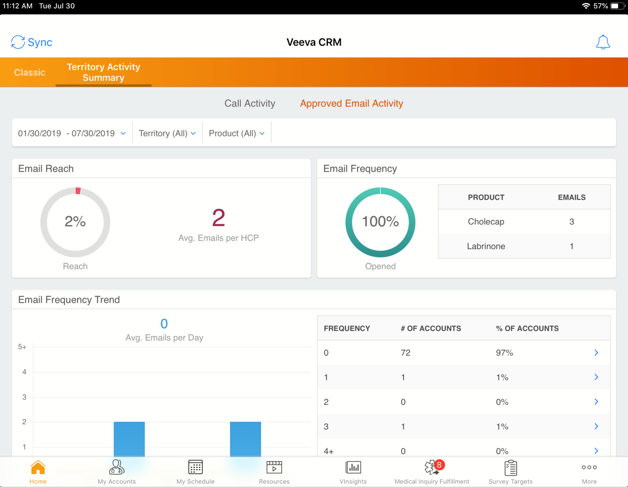
The screenshot depicts the 'Territory Activity Summary' dashboard within the Veeva CRM application, as displayed on an iPad. The dashboard focuses on email activity, showing data for the period from January 30, 2019, to July 30, 2019, for 'All' territories and 'All' products. The 'Email Reach' section shows that the reach is at 2%, with an average of 2 emails per HCP. Adjacent to this, the 'Email Frequency' section displays a 100% opened rate. A table provides further details on email frequency based on the product. Specifically, 'Cholecap' has 3 emails, while 'Labrinone' has 1 email. The 'Email Frequency Trend' section shows a bar graph with data points and indicates an average of 0 emails per day. Below this graph is a table displaying the 'Frequency,' '# of Accounts,' and '% of Accounts'. The table shows various frequencies (0, 1, 2, 3, 4+) along with the corresponding number and percentage of accounts. For instance, a frequency of '0' corresponds to 72 accounts, which represents 97% of accounts. Arrows on the right side of the table may indicate further drill-down options. At the bottom of the screen, a navigation bar presents icons for 'Home,' 'My Accounts,' 'My Schedule,' 'Resources,' 'VInsights,' 'Medical Inquiry Fulfillment' (with a notification badge showing '8'), 'Survey Targets,' and 'More'.