
Provider Dashboard
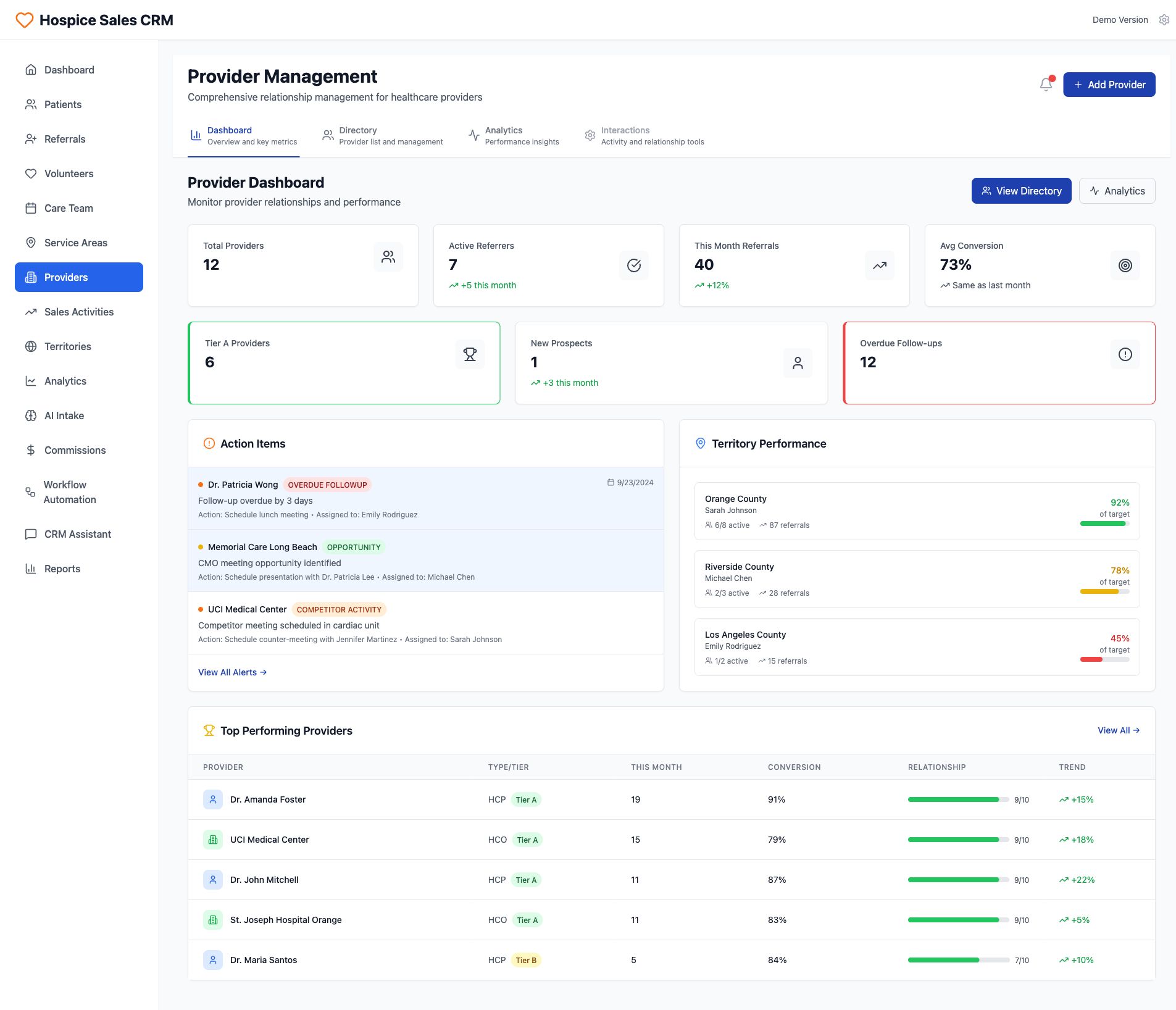
The interface presents a comprehensive 'Provider Management' dashboard within the 'Hospice Sales CRM' platform, designed for healthcare provider relationship management. A left-hand navigation sidebar features various modules, with 'Providers' currently selected and highlighted in blue. The main content area begins with the 'Provider Dashboard' title and subtitle, 'Monitor provider relationships and performance', followed by a series of key performance indicator cards. These cards display essential metrics such as 'Total Providers' (12), 'Active Referrers' (7, showing a +5 increase this month), 'This Month Referrals' (40, up by +12%), and 'Avg Conversion' (73%, noted as 'Same as last month'). Additional summary cards highlight 'Tier A Providers' (6, emphasized in green), 'New Prospects' (1, with a +3 increase this month), and critically, 'Overdue Follow-ups' (12, prominently displayed in red to signify urgent attention). Below these metrics, an 'Action Items' panel lists specific tasks, including an 'OVERDUE FOLLOWUP' for Dr. Patricia Wong due on 9/23/2024, an 'OPPORTUNITY' for Memorial Care Long Beach, and 'COMPETITOR ACTIVITY' for UCI Medical Center, each with assigned actions and personnel. A 'View All Alerts' link suggests more detailed information is available. Adjacent to the action items, the 'Territory Performance' panel outlines referral data by geographical region, detailing active providers and referrals for Orange County (92% of target), Riverside County (78% of target), and Los Angeles County (45% of target), visually represented with color-coded progress bars indicating performance against targets. The bottom section, 'Top Performing Providers', presents a sortable table with columns for 'PROVIDER', 'TYPE/TIER', 'THIS MONTH's' activity, 'CONVERSION' rates, 'RELATIONSHIP' strength, and 'TREND'. Notable entries include Dr. Amanda Foster with 19 activities and 91% conversion, and UCI Medical Center with 15 activities and 79% conversion, both designated as 'Tier A' providers with strong relationship indicators and positive trends. The interface incorporates interactive elements like navigation tabs ('Dashboard', 'Directory', 'Analytics', 'Interactions') and action buttons such as 'Add Provider', 'View Directory', and 'Analytics', facilitating user interaction and data exploration.