
Sentiment Radar
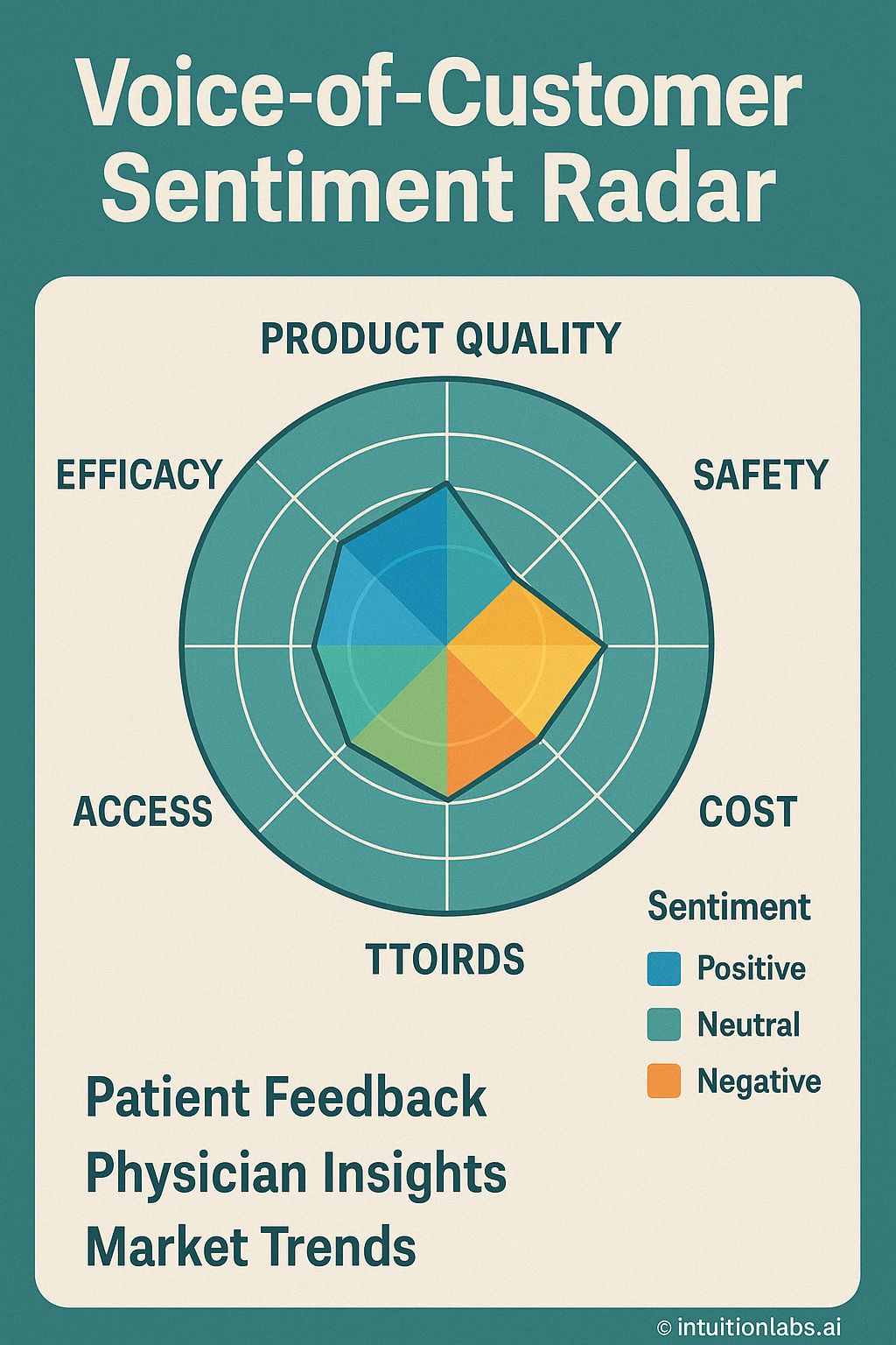
The infographic visualizes a Voice-of-Customer Sentiment Radar, assessing product perception across multiple key factors. The radar chart features axes representing Product Quality, Safety, Cost, TTOIRDS, Access, and Efficacy, arranged in a circular layout. Sentiment is categorized as Positive (blue), Neutral (green), and Negative (orange), with colored segments indicating sentiment strength for each factor. The central polygon illustrates combined sentiment, with blue denoting positive sentiment regarding Product Quality and Efficacy, green indicating neutral sentiment for Access, and orange signifying negative sentiment concerning Cost and TTOIRDS. Safety has no specified sentiment. Below the radar, primary data sources are listed as Patient Feedback, Physician Insights, and Market Trends, implying inputs that contribute to sentiment analysis. The sentiment score is visualized using the filled radar graph. The legend provides a clear distinction between Positive, Neutral, and Negative sentiments, associating each with a corresponding color for easy interpretation.