
HCP Webinar Metrics
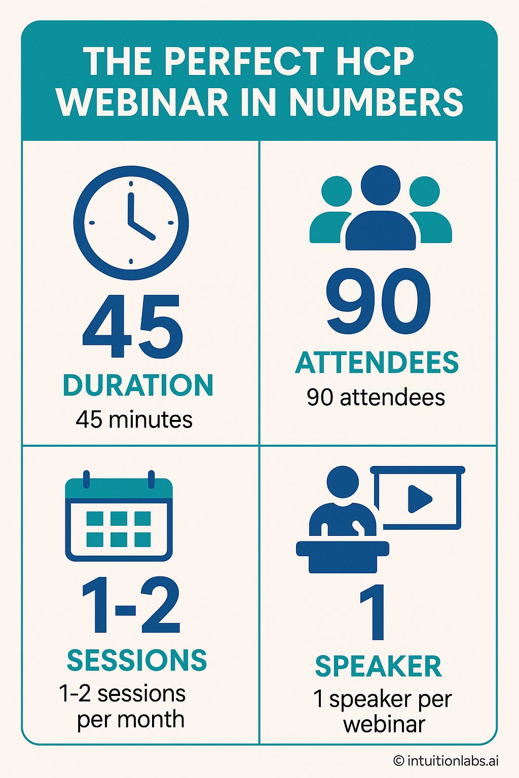
The infographic presents key performance indicators for a successful Healthcare Professional (HCP) webinar. It's structured as a four-panel display with a teal-and-cream color scheme. The top-left panel features a clock icon representing "Duration", indicating the ideal webinar length is 45 minutes. The top-right panel shows three stylized figures, signifying "Attendees", reporting a recommended 90 attendees. The bottom-left displays a calendar icon symbolizing "Sessions", suggesting an optimal frequency of 1-2 sessions per month. The bottom-right panel illustrates a speaker icon, denoting "Speaker", highlighting that the best practice involves one speaker per webinar. The heading reads "The Perfect HCP Webinar in Numbers", and each panel includes a title and descriptive text clarifying the metrics presented. All design elements and typography are clean and modern. The infographic uses numerical values to emphasize each metric, providing a concise and readily understandable overview of the essential factors for planning an effective HCP webinar.