
Formulary Shock
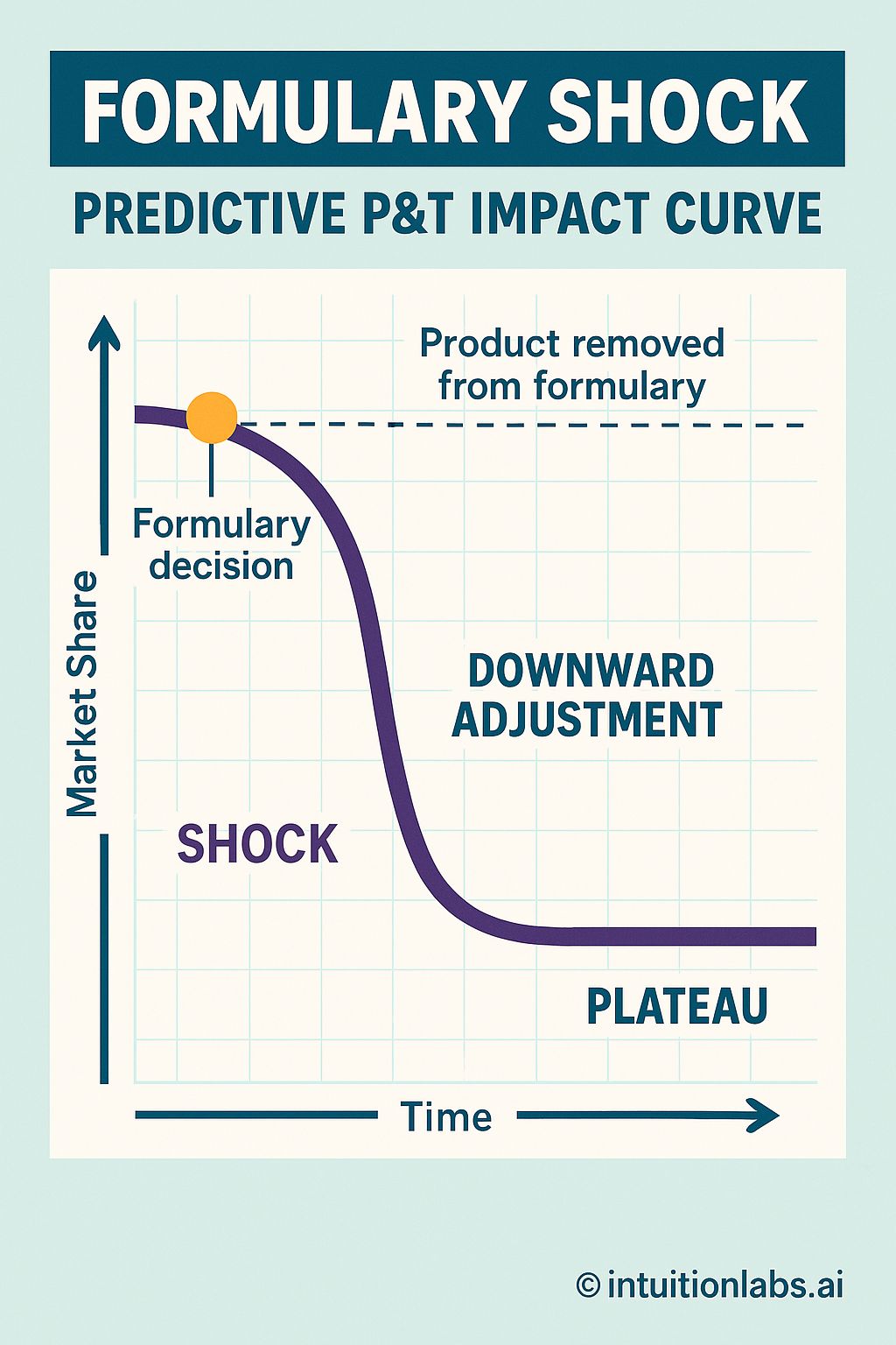
The infographic presents a "Formulary Shock" curve illustrating the predictive impact on market share following a product's removal from a formulary. A downward sloping curve is plotted on a standard x-y axis. The Y-axis is labeled as "Market Share," ascending from bottom to top. The X-axis is labeled "Time" progressing from left to right, indicating the duration following the formulary change. A horizontal dashed line signifies the product's initial market share before removal. At the point where the curve begins its decline, a vertical line connects a yellow dot to the curve, labeled "Formulary Decision". The curve rapidly descends from this initial point, and this drop is annotated as "SHOCK". The steepest part of the curve is labeled "DOWNWARD ADJUSTMENT." Finally, the curve flattens out towards the bottom-right, and this section is labeled "PLATEAU," representing the stabilized market share after the initial shock and downward adjustment. The initial flat portion of the curve before the decline is marked with the annotation "Product removed from formulary".