
Data Pyramid
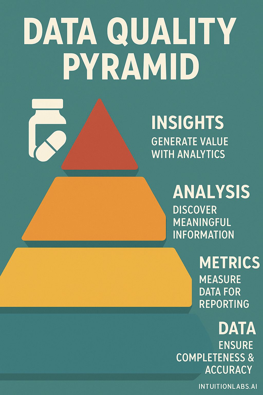
The infographic visualizes a "Data Quality Pyramid", a hierarchical model representing stages in data management and analysis. The pyramid is constructed from four levels, each a different color and decreasing in size as one ascends. The base level, teal in color, is labeled "DATA" and states "ENSURE COMPLETENESS & ACCURACY". Moving up, the next level is yellow, labeled "METRICS" with the instruction "MEASURE DATA FOR REPORTING". Above this is an orange layer labeled "ANALYSIS" and explains to "DISCOVER MEANINGFUL INFORMATION". The top level is red, labeled "INSIGHTS", encouraging users to "GENERATE VALUE WITH ANALYTICS". To the left of the top level, there is a graphic of what appears to be a pill bottle and a single pill next to it. The design suggests that each stage is dependent on the quality of the preceding layer. The teal background provides contrast to the pyramid's color scheme and labels. The website intuitionlabs.ai is at the very bottom of the graphic.