
Data Lake vs. Swamp
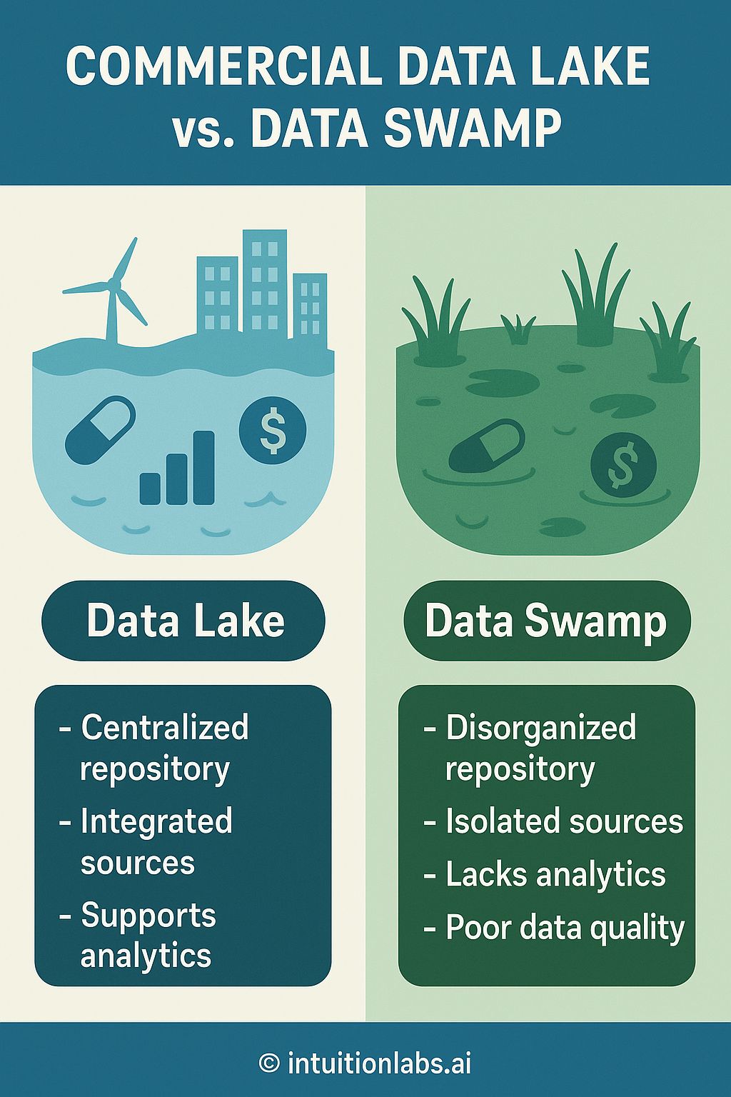
The infographic visually compares and contrasts a "Data Lake" with a "Data Swamp." It's divided into two main sections, one for each concept. The 'Data Lake' side, rendered in blue hues, presents a clean water body populated with a windmill, city buildings, a rising bar graph, and a dollar sign, representing centralized and integrated data management and analytics support. The associated text highlights features such as a centralized repository, integrated sources, and support for analytics. Conversely, the 'Data Swamp' side, depicted in shades of green, displays stagnant water with weeds, a sunken object resembling a pill, and a dollar sign, suggesting a disordered and isolated data environment. It's characterized by a disorganized repository, isolated sources, a lack of analytics, and poor data quality, as indicated in the accompanying text. The overall layout uses clear visual metaphors to differentiate between the two data management approaches. The infographic uses a visual hierarchy placing the title "COMMERCIAL DATA LAKE vs. DATA SWAMP" at the top. The descriptions under each section use bullet points to clearly state the attributes of each data solution. The bottom indicates the source as intuitionlabs.ai.