
capa · corrective-and-preventive-actions
CAPA Dashboards in the Pharmaceutical Industry: An Implementation Guide
April 18, 2025
55 min read
Comprehensive guide on implementing CAPA dashboards in pharmaceutical quality management, covering data requirements, key metrics, dashboard design principles, and implementation in Power BI, Tableau, and Google Data Studio.

- 01The FDA's Quality Management System Regulation (QMSR) took effect on February 2, 2026 and incorporates ISO 13485:2016 by reference for medical device CAPA requirements.
- 0221 CFR 211.192 requires that any unexplained discrepancy or batch failure be thoroughly investigated with a written record of the investigation, conclusions, and follow-up.
- 03Power BI Pro pricing is currently $14 per user/month, with Premium Per User (PPU) at $24/month for advanced features.
- 04ISO 13485 clauses 8.5.2 and 8.5.3 address corrective action and preventive action respectively, and CAPA procedures should map to these clauses under QMSR.
- 05A CAPA dashboard should track core metrics like open CAPAs, overdue CAPAs, average time to close, CAPA aging at 30, 60, and 90 day thresholds, and effectiveness rate.
[Revised July 10, 2026]
Introduction to CAPA in Pharma and Regulatory Context
Corrective and Preventive Action (CAPA) is a core process in pharmaceutical quality management. It refers to the systematic investigation of quality deviations or issues (nonconformities) and the implementation of corrective actions to fix those issues and preventive actions to stop recurrence. In highly regulated industries like pharma, CAPA systems are not just best practice – they are often mandated by regulators as part of Good Manufacturing Practice (GMP) requirements. International guidance such as ICH Q10 (Pharmaceutical Quality System) identifies CAPA as one of four recommended pharmaceutical quality system elements, alongside process performance and product-quality monitoring, change management, and management review ([1]). ICH Q10 supplements applicable regional GMP requirements; manufacturers must meet the requirements that apply in their jurisdiction, including requirements for investigating relevant discrepancies and failures. The European Union's equivalent requirement sits in EudraLex Volume 4, Chapter 1, which directs manufacturers to apply "an appropriate level of root cause analysis" during investigations and to identify and monitor the effectiveness of resulting CAPAs ([2]), and the World Health Organization publishes a parallel GMP standard used internationally to assess manufacturing authorizations ([3]).
The WHO publishes an analogous GMP standard used to justify GMP status internationally under its Certification Scheme for pharmaceutical products moving in international commerce, reinforcing that CAPA-style closed-loop quality management is a globally, not just regionally, expected practice ([3]). Regulatory agencies expect a closed-loop CAPA process that feeds into continuous improvement. For example, the U.S. FDA's quality system regulations (21 CFR Parts 210/211 for drugs and Part 820 for devices) emphasize that firms should collect and analyze information on quality issues, identify unfavorable trends, investigate root causes, and implement effective CAPAs ([4]). For drug manufacturers, 21 CFR 211.192 requires that any unexplained discrepancy or batch failure "shall be thoroughly investigated" with a written record of the investigation, conclusions, and follow-up ([5]). For device manufacturers, QMSR requires a documented quality management system that complies with ISO 13485:2016 as incorporated by reference and with other applicable Part 820 requirements. ISO 13485 clauses 8.5.2 and 8.5.3 address corrective action and preventive action, respectively; 21 CFR 820.10 requires the quality management system to be documented. These device requirements are distinct from drug CGMP requirements. ([6]; FDA QMSR final rule) A 2024 peer-reviewed review in Cureus similarly frames CAPA as the mechanism that shifts pharmaceutical quality management "from reactive to proactive" when root cause analysis and effectiveness verification are applied consistently ([7]). During FDA inspections, CAPA systems are a key focus area. FDA's device CAPA inspection guide addresses data analysis, investigation, effectiveness verification, implementation, documentation, and communication for management review; it does not provide a single cross-industry percentage or ranking for Form 483 observations ([4]). This underscores the importance of maintaining CAPA processes that meet the applicable regional GMP and product-specific regulatory requirements.
Key 2026 Regulatory Update: For medical device manufacturers, the FDA's Quality Management System Regulation (QMSR) took effect on February 2, 2026 and incorporates ISO 13485:2016 by reference. CAPA procedures should therefore map to ISO 13485 clauses 8.5.2 (corrective action) and 8.5.3 (preventive action), alongside the applicable current Part 820 provisions—not the withdrawn former § 820.100. Drug manufacturers must separately meet applicable drug CGMP requirements, including 21 CFR 211.192 for investigation of unexplained discrepancies and batch failures. ([6]; FDA QMSR final rule; 21 CFR 211.192) The QMSR page confirms the rule "incorporat[es] by reference the international standard specific for medical device quality management systems," ISO 13485:2016, in place of the prior stand-alone 21 CFR 820 text ([6]). ISO 13485:2016 itself is the internationally recognized quality management system standard for medical device design and manufacture, built around risk management and risk-based decision making ([8]).
Given this context, the ability to monitor and report on CAPA activities is vital. Management needs visibility into how well the CAPA system is working: Are issues being addressed promptly? Are there recurring problems? Are we meeting internal and regulatory expectations for quality improvement? This is where a CAPA dashboard comes into play. A CAPA dashboard is a reporting interface (often part of an electronic QMS like Veeva Vault or business intelligence tool) that aggregates CAPA data into key metrics and visualizations for quick insight. By providing a real-time window into CAPA performance, dashboards help ensure the CAPA process remains effective, proactive, and in control of regulatory risk.
Power BI Pro monthly price per user
Effective date of FDA's Quality Management System Regulation (QMSR)
Standard time frame benchmark for closing CAPAs
ISO 13485 clause for corrective action referenced under QMSR
- ICH Q10ICH Q10 Pharmaceutical Quality System
Identifies CAPA as one of four recommended pharmaceutical quality system elements alongside monitoring, change management, and management review.
- EUEudraLex Volume 4, Chapter 1
Directs manufacturers to apply an appropriate level of root cause analysis and monitor CAPA effectiveness during investigations.
- FDA21 CFR 211.192
Requires any unexplained discrepancy or batch failure to be thoroughly investigated with a written record.
- 2024Cureus peer-reviewed review
Frames CAPA as the mechanism shifting pharmaceutical quality management from reactive to proactive.
- 2026FDA QMSR
Took effect February 2, 2026, incorporating ISO 13485:2016 by reference for device manufacturers.
Importance of CAPA Dashboards for Managerial Reporting
For managers in QA/QC or operations, a CAPA dashboard serves as an early-warning and performance management tool. Instead of sifting through individual CAPA reports or lengthy spreadsheets, managers can glance at a well-designed dashboard and immediately grasp the state of CAPAs across the organization. This visibility is crucial for several reasons:
-
Regulatory Compliance & Audit Readiness: Managers must be prepared to demonstrate to auditors that the CAPA system is under control. Dashboards compile the evidence – number of open CAPAs, overdue items, verification of effectiveness – that auditors or internal quality committees often request. CAPA is one of the most important quality subsystems, and regulators expect data from it to be available for management review ([9]).
-
Continuous Improvement: CAPA isn't just about fixing problems; it's about learning from them. A dashboard highlights trends (for example, a spike in CAPAs related to a particular process or an increasing time-to-close), allowing management to identify where processes may need broader improvement or preventive action. Tracking these KPIs fosters a proactive quality culture rather than a reactive one.
-
Resource and Performance Management: By looking at CAPA metrics, managers can gauge workload and efficiency. A high number of open CAPAs might indicate resource constraints or bottlenecks in investigations. A trend of CAPAs missing due dates could signal that teams need help or that initial timelines are unrealistic. Conversely, seeing CAPAs steadily closed on time is a positive indicator of team performance and effective prioritization.
-
Accountability and Engagement: Dashboards make CAPA performance transparent across the management team. When, for example, each department's open CAPAs or each manager's pending actions are visible, it tends to heighten personal accountability for timely completion. Managers are more likely to follow up on overdue actions when they know the metric is tracked and reported routinely. Publishing CAPA status by responsible person or department can also reinforce ownership and timely follow-up.
-
Focused Management Reviews: CAPA dashboards provide the backbone data for periodic Quality Management Reviews. Rather than reviewing individual cases, senior management can review the CAPA metrics summary to assess the health of the quality system. Typical management review presentations will include data such as the number of CAPAs opened/closed in the period, any overdue corrective actions, CAPA effectiveness check results, and trends by category. Having a live dashboard ensures those numbers are up-to-date and accurate, making review meetings more efficient and evidence-based.
In summary, a CAPA dashboard empowers pharma managers by converting raw CAPA records into actionable intelligence. It aligns teams on where attention is needed and provides confidence (to management and regulators alike) that the organization is on top of its quality problems and continuously improving.
Data Requirements and Key CAPA Metrics
Before building a CAPA dashboard, it's important to understand the data that feeds it. CAPA data typically comes from a quality management system or CAPA tracking log. Ensure you have access to the following core data fields for each CAPA record:
- CAPA ID or Reference: A unique identifier for each CAPA (e.g., CAPA-2025-001).
- Issue Description: A short summary of the problem/deviation that led to the CAPA.
- Origin/Source: How the issue was identified (e.g., internal audit, customer complaint, manufacturing deviation, inspection finding).
- Initiation Date: When the CAPA was opened.
- Target Due Date: When the CAPA (or its actions) are supposed to be completed.
- Closure Date: When the CAPA was fully closed/resolved (if closed).
- Status/Phase: Current status (e.g., Open, In Progress, Pending Effectiveness Check, Closed). This can be simplified to Open vs Closed for reporting, but tracking intermediate phases can help identify bottlenecks (e.g., many CAPAs stuck "in verification").
- Responsible Person/Department: Who is in charge of the CAPA or which department it belongs to.
- Root Cause Category: Classification of the root cause determined (for example: Training deficiency, Equipment failure, Process/design issue, Material issue, Human error, etc.). ASQ defines a root cause as "the core issue... that sets in motion the entire cause-and-effect reaction that ultimately leads to the problem(s)," and documents structured methods such as events and causal factor analysis, barrier analysis, and change analysis for identifying it ([10]).
- CAPA Effectiveness Result: If an effectiveness check was performed after implementation, was it successful? (Yes/No or percentage of actions effective on first try). ICH Q10 ties this field directly to regulatory expectations, stating that CAPA methodology "should result in product and process improvements and enhanced product and process understanding" rather than simply closing the paperwork ([1]).
- Severity/Criticality: (If applicable) classification of the issue's risk level (Critical, Major, Minor) which might dictate priority. ICH Q9(R1) directs that "the level of effort, formality, and documentation of the investigation should be commensurate with the level of risk," which is the regulatory basis for triaging CAPA dashboards by severity rather than treating every open item identically ([11]).
Using these fields, we can derive key metrics and KPIs for the CAPA process. The table below outlines some essential CAPA metrics and what they indicate:
| Metric | Description & Significance |
|---|---|
| # of Open CAPAs | Count of CAPAs that are currently open (not yet closed). A higher number could indicate backlog or resource issues, while too low a number might indicate issues are not being logged as they should. Managers track this to ensure CAPAs are being actively managed. |
| # of Closed CAPAs | Count of CAPAs closed in a given period (e.g., month/quarter). By comparing closed vs opened over time, one can see if the team is keeping up with incoming issues or if backlog is growing. |
| Average Time to Close | The average duration (in days) from CAPA initiation to closure. This efficiency metric shows how quickly issues are resolved. Consistently long closure times may indicate process inefficiencies or overly complex issues. |
| # of Overdue CAPAs | How many open CAPAs have passed their target due date. Overdue CAPAs are a red flag for regulators and management, especially if they are high-risk issues. This should be as low as possible. Some organizations further break this down by severity (e.g., X critical CAPAs overdue). |
| CAPA Aging | Distribution of open CAPAs by age buckets (e.g., how many have been open >30 days, >60 days, >90 days) ([12]). This highlights stalled issues. Best practice is to close CAPAs within a standard time frame (e.g., 60 or 90 days) whenever possible. |
| CAPA by Root Cause | Breakdown of CAPAs by root cause category (often shown as a pie or bar chart). This reveals common problem areas – for example, a large slice for "Training" issues might mean training programs need improvement. ASQ's root cause analysis resources, including the Ishikawa (fishbone) diagram and Pareto chart, are standard tools for building and interpreting this breakdown ([10]). |
| CAPA by Source | Breakdown by the source of issue (e.g., 40% from manufacturing deviations, 30% from audits, 20% from customer complaints, etc.). This helps in understanding where most issues are being found and could indicate upstream process weaknesses (for example, many CAPAs from customer complaints might point to earlier QA gaps). |
| CAPA Status Distribution | Current status of all CAPAs (e.g., 10 in Investigation, 5 in Implementation, 3 pending Effectiveness Check, 20 Closed). Often a simple Open vs Closed vs Overdue visualization is used. This shows overall progress and any bottlenecks in the CAPA workflow. |
| Effectiveness Rate | Percentage of CAPAs that passed their effectiveness check on first attempt (i.e., the corrective action truly prevented recurrence) ([13]). A high "first-time effectiveness" rate (approaching 100%) indicates the team is identifying true root causes and implementing durable fixes. A lower rate might signal that fixes are not fully solving problems, requiring repeat CAPAs or follow-ups. ICH Q10 states that "the effectiveness of the actions should be evaluated" as part of the CAPA system, making this metric an important recommended quality-system practice ([1]); a 2024 peer-reviewed analysis of CAPA frameworks reaches the same conclusion, arguing that verified effectiveness is what separates a proactive quality system from a reactive one ([7]). |
| # of Repeat Issues | How many CAPAs are for problems that have occurred before (sometimes called repeat CAPAs). Repeat issues suggest the initial fixes didn't work or there are systemic issues not fully addressed. This metric ties into effectiveness; ideally repeat CAPAs should trend downward if preventive actions are working. |
| New Preventive Actions | Count of new controls or process changes implemented as part of CAPAs over time. This highlights proactive improvements (e.g., procedures updated, equipment upgraded, training instituted) that stem from CAPA work. It shifts focus to how CAPA drives positive change, not just fixes problems. |
Not every dashboard will include all these metrics, but these are common examples. Focus on the metrics that matter most to your organization's goals. For instance, if meeting due dates is a big concern, emphasize overdue CAPAs and aging. If reducing recurrence is key, highlight root cause trends and effectiveness rates.
Suggested Dashboard Layout and Design Elements
Designing a CAPA dashboard requires balancing clarity, detail, and usability. Here are some best practices and suggested layout elements to make the dashboard intuitive for managers:
-
Keep it Simple and Focused: A dashboard should tell a story at a glance. Emphasize the most important KPIs at the top in a clear, large format (for example, use KPI cards or big numeric indicators for "Open CAPAs", "Overdue CAPAs", and "Avg Closure Time"). Avoid cluttering the screen with every possible metric – stick to a handful of critical visuals that answer key questions about CAPA performance. Additional details can be available via drill-down or on secondary pages if needed.
-
Logical Grouping and Flow: Organize visuals in a way that flows logically. One approach is to start with high-level indicators (overall counts and status) and then show breakdowns and trends below. For instance, the top row might show total Open CAPAs, Overdue CAPAs, and Average Days to Close. The next section could present trend charts over time, and below that, category breakdowns. Arrange charts so that related metrics are near each other. Many designers follow a left-to-right or top-to-bottom hierarchy from overview to detail. Ensure the layout aligns with how a manager would think through the data (e.g., "Are we overwhelmed with CAPAs? Are we closing them fast enough? What are the main causes?" in that order).
-
Use Visual Variety Appropriately: Different insights call for different chart types. For CAPA dashboards, time-series charts and categorical breakdown charts are most common:
-
Trend Over Time: A line chart (or combo chart) showing CAPAs opened vs. CAPAs closed per month is extremely useful to visualize the trend and balance of the CAPA system. It shows whether the backlog is growing or shrinking and seasonal patterns of CAPA activity. Including a running total of open CAPAs (like a backlog line) can also be helpful. Make sure time axes are clear (months, quarters, etc.) and consider a reference line for average or target.
-
Category Breakdown: Pie charts or bar charts can show the proportion of CAPAs by category (such as root cause, department, or CAPA type). Pie charts give a quick sense of largest categories, whereas horizontal bar charts handle long category labels well and allow easy comparison of counts. For example, a pie or bar chart of CAPAs by root cause category helps pinpoint the dominant causes of quality issues.
-
Intuitive Color Coding: Use colors meaningfully. A common scheme is green for closed/on-track CAPAs and red for overdue or problematic CAPAs, which immediately flags issues. If you use pie slices or multiple bars, choose distinct colors but keep them soft and business-like (avoid an overly rainbow palette in a professional report). Ensure consistency: e.g., if "Overdue" is red in one chart, use red for any indicator of overdue elsewhere. Also be mindful of color-blind friendly palettes or use patterns in addition to color if needed.
-
Filters and Interaction: For a digital dashboard (in Power BI, Tableau, or Data Studio), incorporate filters that let the user slice the data. Common filters are by date range (to examine a specific period), by product line or site (if your company has multiple manufacturing sites or product families), or by responsible department. For instance, a manager might filter the dashboard to only show CAPAs for their department. Position filter controls at the top or side where they are easily seen. Also consider interactive features: e.g., clicking on a segment of a chart (like a root cause slice) could filter the rest of the dashboard to show only those CAPAs (this is often automatic in tools like Tableau/Power BI via cross-filtering). Interactive drill-down is useful too – for example, double-clicking an "Overdue CAPAs" bar could open a detail table of those specific CAPA cases (in some tools, or via linking to a detailed report).
-
Avoid Overcrowding: Resist the temptation to put too much on one page. Each visual should have enough space to be easily readable. Use short descriptive titles on each chart (e.g., "CAPAs Opened vs Closed – Monthly Trend" or "CAPA Count by Root Cause Category") and label axes or segments clearly. If a chart is not self-explanatory, consider adding a brief note or using tooltips (most BI tools let you configure tooltips that appear on hover) to clarify. Keep text on the dashboard itself minimal; let the visuals do the talking, with maybe a one-line caption if needed for context.
-
Visual Emphasis: Draw attention to critical metrics with subtle design tricks: highlight a KPI number in bold, use a slightly larger font for the most important figure, or place a critical chart in the upper-left (since people's eyes tend to start there). If certain thresholds are important (say, "no CAPA older than 90 days"), you could incorporate a target line or a visual indicator (like a red icon) that appears when a threshold is exceeded.
-
Consistent Style: As this is an internal report for business professionals, maintain a clean, professional style. Use the company's branding or neutral tones. Ensure all charts use the same font and cohesive color set. Consistency makes the dashboard look more polished and credible, allowing managers to focus on the data.
Following these principles will result in a dashboard that is scannable, informative, and actionable. Remember that the goal is to make it easy for a manager (who may not be deeply technical) to understand the CAPA process performance within a few moments of looking at the dashboard. They should be able to identify if everything is on track or if certain metrics require attention.
Example: A line chart showing the trend of CAPAs opened vs. closed each month. In this sample, the orange line represents new CAPAs opened, and the red line shows CAPAs closed. Managers can quickly see if closures keep pace with new issues (e.g., in May-June more CAPAs were opened than closed, indicating a growing backlog, which then tapers off by year-end). Such a time-series visual helps in understanding workload and backlog trends over time.
Example: A bar chart breaking down CAPA count by root cause category. This illustrative chart shows categories like "Human Error/Training," "Process/Method," "Equipment/Facilities," etc., with the length of the bar indicating the number of CAPAs attributed to each cause. Visualizations like this help identify the most prevalent root causes (here, Process issues and Human Error are leading causes). A manager might interpret this as a need to improve procedures or training programs. In a dashboard, this chart could be interactive – e.g., clicking on the "Human Error" bar could filter other charts to highlight those specific CAPAs.
These examples represent typical components you'd include in the dashboard. In practice, your actual dashboard might contain additional visuals (for instance, a pie chart for CAPAs by department, or a gauge showing the percentage of CAPAs closed on time). The key is to combine these elements into a single cohesive view that addresses the needs of your audience.
“In summary, a CAPA dashboard empowers pharma managers by **converting raw CAPA records into actionable intelligence**.
Implementing CAPA Dashboards in Power BI
Microsoft Power BI is a popular choice for creating interactive dashboards due to its user-friendly interface and robust data modeling capabilities. As of 2025-2026, Power BI has introduced significant enhancements including Copilot AI integration for natural language queries, improved Card visuals (now generally available), and enhanced mobile app capabilities. Power BI Pro pricing is currently $14 per user/month, with Premium Per User (PPU) at $24/month for advanced features ([14]; Power BI November 2025 Features). For pharmaceutical applications, Power BI can provide technical controls such as Row-Level Security (RLS) and encryption, but those controls alone do not establish HIPAA or 21 CFR Part 11 compliance. The organization should determine whether the reporting system and records are in scope, validate the computerized system as appropriate, implement applicable record, signature, access, and procedural controls, and document its compliance assessment. Microsoft's own RLS guidance stresses that "it's important to understand RLS filters table rows" and cannot restrict access to tables, columns, or measures directly, so a CAPA dashboard's role design should be modeled and tested (using the Desktop "View As" command) before it is treated as a compliance control ([15]). Whether the reporting layer and its records require validation or specific Part 11 controls should be determined and documented based on the system's intended use, the electronic records relied upon for regulated activities, and applicable predicate-rule requirements. FDA recommends basing computer software assurance on a justified and documented risk assessment and determining the system’s potential to affect product quality, patient safety, and record integrity ([16]).
Here's a step-by-step guide to building a CAPA dashboard in Power BI:
-
Data Preparation: Prepare your CAPA data source. This could be an Excel file exported from a QMS, a CSV log, or a direct database connection (e.g. SQL database where CAPAs are stored). Ensure the data includes the fields mentioned earlier (ID, dates, status, etc.). If your data comes from multiple tables (for example, a CAPA master table and a separate table for CAPA actions), you might need to establish relationships or merge them. In Power BI Desktop, use the Power Query Editor to clean and transform data as needed (for instance, calculate "Days to Close" as a new column by subtracting Initiation Date from Closure Date, or add a boolean "Overdue" flag based on Due Date).
-
Connecting Data: Load the data into Power BI. In Power BI Desktop, click "Get Data" and select the appropriate source (Excel, CSV, database, etc.), then load or transform the data. Once loaded, verify the data types (dates should be date type, numbers as numbers, etc.) and relationships. If needed, create a date table so you can easily do time intelligence (like month/year hierarchies for trending).
-
Create Measures (DAX): This step may be optional if simple count fields suffice, but often you'll create measures in Power BI's Data Modeling view for key metrics. For example, create a measure for "Open CAPAs" (count of rows where Status ≠ Closed), "Closed CAPAs" (count where Status = Closed and within a given period), "Overdue CAPAs" (count where Status ≠ Closed and Today > DueDate), or "Avg Days to Close" (average of the Days to Close field for closed CAPAs). DAX (Data Analysis Expressions) formulas allow these to update dynamically with filters. For instance:
Open CAPA Count = CALCULATE(COUNT(CAPA[ID]), CAPA[Status] <> "Closed")Avg Closure Time = AVERAGE(CAPA[DaysToClose])(with a visual level filter or slicer to only include closed CAPAs). Ensure these measures are tested and showing correct results (you can use a simple table visual in Power BI to list them out for a sanity check). Consider specialized custom analytics solutions for more complex needs.
- Designing the Dashboard (Report View): Drag and drop visuals onto the canvas in Power BI's Report view:
- KPI Cards: Use the Card visual to display single numbers like Open CAPA Count, Overdue Count, etc. You can format the card with a large font and perhaps conditional formatting (e.g., the card turns red if Overdue > 0 or if Avg Days to Close > some threshold).
- Line/Area Chart: Select a Line chart visual for the trend of opened vs closed CAPAs over time. Assign the x-axis to the Date (month) and the y-axis to the measure of count. You can put two measures (Opened and Closed) as two series on the Y-axis. Ensure the date axis is continuous (Power BI might default to a hierarchy – you can change it to continuous to show a proper timeline). Add a legend or customize the line colors (e.g., one line orange, one line green).
- Pie or Bar Chart: For root cause breakdown, use a Pie Chart visual (or Stacked Bar). Set the legend or category to Root Cause Category, and the value to count of CAPA IDs. This will automatically show the proportion of CAPAs per cause. If using a bar, use a horizontal bar chart sorted descending by count for readability.
- Stacked Bar or Column Chart: You might also add a bar chart for status distribution (Open vs Closed vs Overdue). For example, a stacked bar could show, for each department, how many CAPAs are open vs closed (to compare performance across departments). Or a simple column chart could show counts of CAPAs by severity class.
- Table or Matrix (optional): Sometimes managers appreciate a detailed table at the bottom for reference. You can add a table with key fields (ID, Title, Status, Days Open, etc.) and enable Power BI's conditional formatting to highlight, say, overdue rows in red. This gives the ability to drill into specifics if needed.
- Arrange the visuals neatly. You can use Power BI's alignment tools to line up chart edges and ensure consistent spacing.
-
Slicers and Filters: Add slicers for interactivity. For instance, include a Date slicer (perhaps by year/quarter or a range slider) so the user can filter the dashboard to a specific timeframe (e.g., show only CAPAs opened in 2024). Add a slicer for Department if you want to filter CAPAs by responsible department, or for CAPA Type (if you categorize CAPAs into types). In Power BI, slicers will filter all visuals on the page by default. You can also edit interactions if needed (for example, maybe the date slicer should affect all charts, but a slicer by Department might not apply to an overall company-wide KPI – you have control to include/exclude interactions).
-
Formatting and Final Touches: Polish the visuals:
- Give each visual a concise title (Power BI allows custom text titles or even dynamic titles using expressions if desired). E.g., "CAPAs Opened vs Closed (by Month)", "CAPA Count by Root Cause", "Open vs Closed Status by Dept", etc.
- Format the axes and data labels. For the line chart, consider enabling data labels or an average line if it doesn't clutter. For the pie, perhaps show data labels as percentages or counts. Ensure labels are not too small – increase text size for legibility in a meeting room.
- Use company color themes if available. Power BI has a Themes feature; you can import a JSON theme to apply corporate colors or choose from built-in themes that look professional.
- If you have targets, you can add reference lines. For example, if the target average closure time is 60 days, add a constant line at Y=60 on the time-to-close chart or simply note it in the title ("Avg Closure Time (target 60 days)").
- Check that the dashboard is legible on common display mediums (a laptop screen, a projector). Power BI's view can be set to "Fit to page" or "Actual size" to preview.
- Publish and Share: Once satisfied, publish the report to the Power BI Service (if using Power BI Pro or higher). In the service, you can pin visuals or the whole report to a Dashboard (the terminology difference: in Power BI Desktop you create a report with multiple visuals; in the Power BI cloud you can create a dashboard of pinned tiles. But for simplicity, you might just use the report as the interactive dashboard). Share it with relevant managers or embed it in a SharePoint/Teams page for easy access. You can also schedule a data refresh (if connected to a live data source or scheduled refresh for Excel/CSV) so that the dashboard updates automatically (e.g., daily or weekly). For management meetings, you might use the Power BI report in presentation mode, or export it to PDF/PPT if a static snapshot is needed.
Power BI offers rich interactive capabilities, so encourage managers to click on segments and use slicers to explore the data. For example, a QA manager could select a specific month to see only CAPAs from that period, or click on the "Equipment" root cause slice to have all other charts filter to just those equipment-related CAPAs. This interactive exploration can yield deeper insights during review meetings (e.g., "All our overdue CAPAs are in the Training category, why is that?").
Tip: Leverage Power BI's drill-through pages if you want to show detail on demand. You could create a separate page that lists detailed CAPA records and set it as a drill-through target from the main dashboard (for instance, right-clicking a specific segment allows the user to drill through to a page showing the list of those CAPAs). This keeps the main view uncluttered while still providing access to detail when needed.
Clean and transform CAPA data in Power Query Editor, calculating fields like Days to Close and an Overdue flag.
Load the CAPA source via Get Data, selecting Excel, CSV, or database, then verify field types.
Write DAX formulas for metrics like Open CAPA Count and Avg Closure Time so they update dynamically with filters.
Drag KPI cards, line charts, and pie or bar charts onto the Report view to visualize counts, trends, and root causes.
Add slicers for date, department, or CAPA type so all visuals on the page filter together by default.
Publish the report to Power BI Service and pin it to a dashboard for managers to access.
Managers gain an interactive, regularly refreshed CAPA dashboard they can explore during review meetings.
- Power BI offers technical controls like Row-Level Security and encryption, but these alone don't establish HIPAA or Part 11 compliance.
- Microsoft's own RLS guidance warns RLS only filters table rows and cannot restrict access to tables, columns, or measures directly.
- FDA recommends basing computer software assurance on a justified, documented risk assessment.
- Tableau's platform security documentation says user and group roles let one workbook serve every region while each viewer sees only their own records.
- Tableau Agent's newer conversational analytics features, like trend and period-over-period analysis, are still rolling out.
- Teams should confirm a feature is actually available in their Tableau deployment before relying on it.
Both tools require organizational risk assessment and role or security configuration before being treated as compliance controls.
Implementing CAPA Dashboards in Tableau
Tableau is another powerful BI tool well-suited for creating CAPA dashboards, known for its robust visualization capabilities and user-friendly drag-and-drop interface. Tableau's current release information documents Tableau Agent conversational-analytics enhancements in Tableau Next, including trend, composite, and period-over-period analysis and visualizations such as donut charts, heat maps, and scatter plots. Availability varies by product and release, so teams should confirm that a feature is available in their Tableau deployment before relying on it ([17]).
Here's how you can build a CAPA dashboard in Tableau:
-
Connect and Prepare Data: Open Tableau Desktop and connect to your CAPA data source. Tableau can connect to Excel, CSV, databases, etc. After connecting, you'll see the data fields on the left. If your data is in one table, you can proceed; if multiple, use the Data Source view to join or blend data appropriately (e.g., join CAPA table with a Department lookup if needed). Ensure date fields are recognized as dates (you'll see a calendar icon if so). You may create Calculated Fields in Tableau for any needed metrics. For instance, create a calculated field
Days to Close = DATEDIFF('day', [Initiation Date], [Closure Date]). Also, a field for "Overdue" could beIF [Status] <> "Closed" AND TODAY() > [Due Date] THEN "Overdue" ELSE "On Time/In Progress" ENDor similar. Tableau calculations use a syntax somewhat like Excel for basic ones. -
Build Worksheets for Each View: Tableau works by creating individual sheets (each containing one chart or table) which you later combine into a dashboard.
- Worksheet 1 – KPI Summary: You can create a text table that shows key numbers or use Analytics > Summary if needed. However, a better approach is to create individual big number charts using Table Calculations or just by placing a measure on text. For example, drag
IDto Rows, make it a Count (which gives count of CAPAs), then add a filter to include only open CAPAs – this gives "Open CAPAs" count. Tableau doesn't have a native card visual like Power BI, but you can make a text bigger: format it, increase font, and remove headers. Do similarly for "Overdue CAPAs" (apply filter for overdue), etc., each on separate sheets (or use one sheet with multiple text marks if comfortable with Tableau layout containers). - Worksheet 2 – CAPAs Over Time: Reshape the two date columns into events so opened and closed CAPAs share one time axis. In the Data Source view, select Initiation Date and Closure Date, then choose Pivot. Rename
Pivot Field NamestoEvent Date TypeandPivot Field ValuestoEvent Date. CreateEvent Type:IF [Event Date Type] = "Initiation Date" THEN "Opened" ELSEIF [Event Date Type] = "Closure Date" THEN "Closed" ENDIn the worksheet, dragDATETRUNC('month', [Event Date])to Columns as a continuous month,COUNTD([CAPA ID])to Rows, andEvent Typeto Color. Filter out nullEvent Datevalues. This produces two comparable monthly lines—opened and closed—without an undeclared parameter. For database sources that cannot be pivoted in the Data Source view, create the same two event rows with aUNION ALLquery before connecting Tableau. - Format the time trend with appropriate markers or lines. Tableau allows dual-axis: you could place "Opened" and "Closed" as two measures on Rows, then right-click one axis and choose "Dual Axis", synchronizing axes. Use different colors for the two lines and add a legend.
- Worksheet 3 – Root Cause Breakdown: Drag Root Cause to Columns (or Rows) and
Number of Recordsto Rows (or Columns) to create a bar chart of count by root cause. Sort descending by count. Alternatively, use a Pie: drag Root Cause to Color, Number of Records to Angle, perhaps Label for percent. Tableau pies are okay but not as flexible; a bar is often clearer for many categories. Format colors as desired (you can apply a color palette or manually assign e.g. consistent colors if you have a fixed set of causes). - Worksheet 4 – CAPA Status/Phase: If you want a visual for status distribution, drag Status to Columns, count to Rows, get a bar per status. Or better, if focusing on open vs closed: use a calculated field or filter: e.g., a simple pie chart with two segments (Open vs Closed) or a highlight table.
- Worksheet 5 – CAPA Detail (optional): You can create a detailed table showing each CAPA (ID, title, status, days open, etc.) for drill-down. This would be a text table (drag fields into Rows shelf). This can be filtered by actions from the dashboard if set up.
- Assemble the Dashboard: Switch to the Dashboard view in Tableau. Set an appropriate size (Tableau defaults to a fixed size; you might choose a generic resolution like 1000x800 or use a range if deploying to web). Drag your sheets onto the dashboard canvas. Arrange them: perhaps at top place the KPI summary text (you might need to put each big number sheet next to each other horizontally). Below that, place the timeline chart across the width. Next to it or below, place the root cause bar chart. Use containers in Tableau to group and align items – e.g., a horizontal container for KPI numbers, a vertical container for stacking charts. Add titles or explanatory text as needed (Tableau lets you drag a Text object onto the dashboard for any captions or section headers). Ensure everything is visible and not overcrowded.
Tableau's own platform security documentation notes that "user and group roles are also available within workbooks to allow filtering and control of data within dashboards," so a single CAPA workbook can be maintained for every region, site, or department while each viewer sees only their own records ([18]).
-
Filters and Actions: Decide how filters will work. You can add Filter widgets to the dashboard by clicking on a sheet and choosing "Add Filter". For instance, add a filter for Year or for Department. The filter card will appear; you can style it (single-select dropdown vs multi-select, etc.). Use the Apply to Worksheets option to have the filter affect all relevant charts. In Tableau, you can also use interactive Actions: e.g., set the root cause chart so that selecting a bar filters the other charts (this is a Filter Action – you can configure in Dashboard > Actions). There is also a handy feature "Use as Filter" – click on the sheet and in the top-right of it click the funnel icon. This makes that chart a filter for the dashboard. For example, clicking a particular root cause bar can automatically filter the trend and detail table to only CAPAs with that root cause. Similarly, you can allow the time chart to filter details by clicking a month. Be sure to enable relevant actions that make sense.
-
Formatting: Make the dashboard visually appealing:
- Use consistent fonts and a readable size. Tableau defaults are okay, but you might increase font size for titles or important numbers for readability.
- Color the charts consistently. You might use a color legend for status (e.g., Closed = green, Open = orange, Overdue = red) and apply that same palette consistently across sheets (Tableau allows you to set colors for each value in a dimension). For root cause, you can choose a distinct palette or even a meaningful one (like grouping similar causes in shades of the same color).
- Add tooltips that give context. For example, on the trend line's tooltip, show the exact counts of opened/closed in that month. On the root cause bars, show "X CAPAs (Y% of total) were due to [Cause]."
- If needed, add reference lines or annotations (Tableau lets you add reference lines per chart). For instance, an annotation on a spike in the timeline chart to note "Inspection in July caused many new CAPAs" can add narrative.
- Publish/Sharing: Once the dashboard is ready, you can publish it to Tableau Server or Tableau Online if your company uses those. Alternatively, you can export the dashboard as an interactive HTML (if Tableau Public is an option for non-confidential dummy data) or simply present directly from Tableau Desktop. Tableau also allows exporting to PDF or image for static sharing. When sharing with managers, if they have Tableau Reader or access to the Server, they can interact with filters. If not, providing a PDF snapshot for a given month's review might suffice, supplemented by live demos when deeper exploration is needed.
Tableau's strength is in interactive visual analysis, so encourage use of the interactive features during meetings. For example, a manager could click on the "Manufacturing" department filter and instantly see how many CAPAs belong to Manufacturing and their statuses, then switch to "R&D" etc., comparing performance. Or if one root cause category jumps out, they can zoom in on that subset. Tableau's visuals are highly engaging, which can turn a passive report into an active discussion tool.
Tip: Use Tableau's storytelling feature (Story worksheets) if you want to present a sequence, such as "Slide 1: Overall CAPA summary, Slide 2: Focus on a particular trend or category" – but for most purposes a single dashboard with interactive filters is sufficient.
Implementing CAPA Dashboards in Looker Studio
Looker Studio (formerly Data Studio) is a no-cost, web-based dashboarding tool that can be useful for CAPA reporting, especially when data is already in Google Sheets or other Google-compatible sources. Looker Studio provides configurable charts, tables, viewer filters, date-range controls, and connections to a range of data sources. Its enterprise features can help organizations manage users and control access to Looker Studio assets.
Here's how to implement a CAPA dashboard in Looker Studio:
-
Data Source Setup: Prepare your data in a Google-accessible format. A common approach is to keep an up-to-date Google Sheet with all CAPA records (either maintained manually, or via an export from another system). Alternatively, Looker Studio can connect to CSVs, databases, or Google BigQuery if your company stores data there. For a simple start, assume a Google Sheet "CAPA Data" with columns as described (ID, Status, Open Date, Close Date, etc.). Ensure dates are in a proper date format and text fields for categorical data.
-
Create a Looker Studio Report: Go to Looker Studio and create a new report. Add a Data Source by selecting your Google Sheet (or other source). Looker Studio will list the fields and try to assign types. Verify the field types (mark date fields as Date type, numeric as numeric, etc.). You can create Calculated Fields in Data Studio for needed metrics (for example,
Days_to_Close = DATE_DIFF(Close_Date, Open_Date)when both fields are Date values, orStatus_Group = IF(Status="Closed","Closed","Open")to simplify status categories). -
Design the Dashboard Canvas: Looker Studio is quite flexible with free-form layout. You start with a blank canvas. Set the page size under Layout (maybe 16:9 screen ratio or a custom size). Now add components:
- Scorecards: Use the Scorecard element for single-number KPIs like total Open CAPAs or Overdue. A scorecard can display a single metric; you can select "Count of ID" and then apply a filter on the component for Status=Open, for example, to show open count. You can add multiple scorecards side by side (for Open, Closed, Overdue, etc.). Style them with bold text. Data Studio also allows setting up conditional coloring (e.g., if value > X then color red).
- Time Series Chart: Add a Time Series component for the trend of CAPAs over time. Looker Studio will require a date dimension (use Open Date for CAPAs opened per period). You can add metrics like Count of IDs. To show closed on the same chart, one way is to use a blended data source or additional metric: simpler is to add another Time Series chart below or overlay and use different metrics. Alternatively, use community visualizations or a combo chart. If needed, a workaround is to create two metrics: e.g.,
OpenedCount = COUNT(ID)(with a filter Open Date in range) andClosedCount = COUNT(ID)(with a filter Close Date in range), then use a combo chart. Looker Studio supports Combo charts, so you can have Opened and Closed as two metrics on the same time axis. Make sure to set the date granularity to month or week as desired. - Pie / Bar Chart: Add a Pie Chart for CAPA by Root Cause. Select dimension = Root Cause, metric = Count of ID. It will show the distribution. You can display labels as percentage or value. Alternatively, use a Bar Chart for root cause distribution: dimension Root Cause on vertical axis, metric count on horizontal, sort by count. This can be easier to read if there are many categories.
- Table (if needed): You could add a table element to list some details (Data Studio tables can include bars in cells or heatmap coloring for values, which could be used for something like highlighting overdue days).
- Geo Map / Others: Unlikely needed for CAPA unless you want to show by site location on a map (only if relevant).
- Layout and Formatting: Position and resize elements on the canvas. Looker Studio uses snap-to-grid and offers style options in the panel:
-
Give each chart a meaningful title (you can just use Text boxes for section headers or enable the chart title option).
-
Choose a clean theme from the Theme gallery or define custom colors. Looker Studio has a default palette but you can customize chart colors individually. Ensure consistent coloring as with other tools (e.g., one color for closed, one for open).
-
For the time series, add a legend or label the lines as "Opened" and "Closed" appropriately. Data Studio might put them both as lines or one as bar, depending on what you choose (you can do a series for opened and closed as separate colored lines).
-
Configure data labels on the pie if desired (Looker Studio allows you to show percentage or absolute values).
-
Use a Date range filter control: Data Studio can have a page-level date filter. You can add a Date Filter control to the top of the dashboard, which lets the user pick a date range that will apply to all date-sensitive charts. For example, a manager could select "Jan–Dec 2024" or a specific quarter.
-
Filter Controls: Add interactive filter controls to allow managers to slice the data. For example, include a Date Range picker at the top of the dashboard (Looker Studio provides a date filter control that can apply to all charts on the page). This lets users adjust the time window for analysis (e.g., look at year-to-date, last quarter, etc.). You can also add a Dropdown filter for categorical fields like Department or Product Line if you want to enable filtering CAPAs by those dimensions. Position these filters prominently (usually along the top or left side).
-
Refine and Validate: Preview the dashboard using different filter settings to ensure everything updates correctly. Check that the numbers make sense (e.g., if you filter to a past year, do the open/closed counts and charts reflect that year's data accurately?). Looker Studio will show "null" or blanks if some data is missing; you might need to handle that (for instance, ensure that closed dates exist for closed CAPAs, etc., or use calculated fields to avoid errors).
- Sharing and Usage: Looker Studio is shareable via link, much like a Google Doc. You can invite specific users or generate a view link. Ensure you set appropriate access (most likely "can view" for managers, so they cannot inadvertently edit the design). Because it's web-based, managers can bookmark the dashboard URL and access it anytime in their browser – no special software needed. The data reflects updates to the underlying Google Sheet or other source according to the connector and refresh configuration.
Looker Studio's strength is ease of use and sharing. Suitability for CAPA dashboards depends on the data volume, connector behavior, and the organization's reporting requirements. The interactivity (like date pickers and dropdowns) is straightforward for users. Managers can even download the report as PDF if they want a snapshot for a meeting, or you can set up a scheduled email delivery of the dashboard on a set cadence (using the subscription feature).
Note: While Looker Studio is flexible, assess its available features, connectors, access controls, and performance against the organization's CAPA reporting requirements before deployment.
“CAPA is one of the **most important quality subsystems**, and regulators expect data from it to be available for management review
Example Datasets and Templates for CAPA Dashboards
To practice or demonstrate a CAPA dashboard, you may want to use a sample dataset. If your company already has CAPA records, you can anonymize and use a subset of that data. Otherwise, consider the following options for example data and templates:
-
Manual Excel/Google Sheets Data: Create a simple spreadsheet with columns for CAPA ID, Initiation Date, Closure Date, Due Date, Status, Root Cause, Department, etc. and fill in some dummy records. For example:
-
CAPA-001 | Opened: 2025-01-15 | Due: 2025-03-01 | Closed: 2025-02-20 | Status: Closed | Root Cause: Training | Dept: Production
-
CAPA-002 | Opened: 2025-01-20 | Due: 2025-02-15 | Closed: null (open) | Status: Open | Root Cause: Equipment | Dept: Maintenance
-
...and so on for 20-50 records to simulate realistic data. This can then be imported into any of the BI tools. This approach is useful for a live demo or testing your dashboard setup before connecting to real data.
-
QI Macros/Excel Template: There are existing simple CAPA tracking templates. The CAPAtrak Simple CAPA Status by Manager Metric Template describes a "Simple Quality Dashboard" Excel template using QI Macros (an Excel add-in) and states that the template is available for download from CAPAtrak. Such a template can generate basic charts in Excel (e.g., CAPAs opened/closed by month, by manager). You could use this as a starting point – input sample data into the Excel and then either use Excel's charts or import the data into Power BI/Tableau for more advanced visuals.
-
Industry Examples: Some quality management software vendors provide example CAPA data or demo dashboards in their blogs and whitepapers. While the actual data may not be downloadable, you can often glean the structure. For example, an AssurX or Veeva Vault whitepaper might show what fields and metrics they track. Also, searching online for "CAPA status dashboard filetype:xls" may yield shared files or examples. Ensure any data you find is sanitized and respect confidentiality if it looks like real company data.
-
Public Data Sources: CAPA data is typically internal and proprietary, so you won't find a direct public dataset on Kaggle specific to CAPAs. However, you might find analogous datasets (like issue tracking or corrective action data in other industries) that you can adapt. In absence of a ready dataset, manually creating a realistic dataset (as above) is often the fastest route.
When demonstrating the dashboards for training purposes, it's helpful to use relatable scenarios in the data. For example, include some CAPAs that are overdue to show how the dashboard flags them, or multiple CAPAs with the same root cause to illustrate the Pareto principle (few causes accounting for many problems), one of the standard root cause analysis tools cataloged by ASQ alongside fishbone diagrams and scatter diagrams ([10]). If you can find a template with pre-built charts, you could import that into the BI tool – but usually, it's easier to rebuild natively following the steps provided.
Finally, remember that the data requirements must match the tool: if using Tableau or Power BI, ensure date fields and categorical fields are clean. If using Looker Studio with Google Sheets, maintain consistent date formats (e.g., ISO date format YYYY-MM-DD) to avoid parsing issues.
Tips for Usability and Interpretation for Managers
Designing the dashboard is half the battle; ensuring it is used effectively by managers is equally important. Here are some tips to maximize usability and help managers interpret the CAPA dashboard correctly:
-
Provide Context and Definitions: Don't assume every viewer knows every term or acronym. Include a small legend or note for any abbreviations (for example, have a text box explaining that "CAPA = Corrective and Preventive Action"). If you use categories like "Major/Minor" or phase names, consider a tooltip or an info icon that provides the definition. This way, new managers or cross-functional stakeholders can grasp the information without confusion. Additionally, it can be useful to note the data currency (e.g., "Data as of [Date]") on the dashboard, so everyone knows how up-to-date the information is.
-
Tell a Story in the Dashboard: Steer the interpretation by how you design the layout. For example, if a manager should focus on overdue CAPAs first, make that number prominent. You might use a subtitle like "Overdue CAPAs – Requires Immediate Attention" near that metric. Another way is to use pre-attentive attributes (color, size, position) to guide the eye. The dashboard should be self-explanatory enough that, without you narrating, a manager can follow the logical flow (perhaps even include numbered arrows or a suggested viewing order if it's static). Some teams also accompany dashboards with a short written analysis summary each month, highlighting key insights ("This month, the number of open CAPAs increased by 10% mainly due to three new issues in Production. The average closure time improved from 45 to 30 days after process changes."). This hybrid approach ensures the data is understood in context.
-
Ensure Data Accuracy and Reliability: Managers will only trust and use the dashboard if they believe the data. Double-check calculations and test the dashboard against known reports. If possible, do a quick sanity check: e.g., manually count a few CAPAs and see if the dashboard matches. Once confident, communicate that the dashboard is the "single source of truth" for CAPA metrics. Avoid having multiple versions of reports that could conflict. This is consistent with FDA's data integrity guidance, which expects firms to implement "meaningful and effective strategies to manage their data integrity risks" for any system used to support CGMP decisions, including reporting layers built on top of the CAPA record ([19]). If a manager finds a discrepancy, address it quickly or explain it (maybe a difference in how a metric is defined). Over time, a reliable dashboard becomes an essential tool in meetings.
-
Interactivity Training: If managers are not familiar with interactive BI dashboards, take a few minutes to show them how to use it. For instance, demonstrate how selecting a filter or clicking on a chart can slice the data. Encourage them to explore: "If you want to see last quarter only, use the date filter here" or "Notice you can hover over the line chart to see exact numbers." Once they see how easy it is, they are more likely to self-serve insights instead of requesting static reports. However, also gauge your audience – some managers may prefer a static PDF printout. You can cater to both by having the live dashboard and also scheduling a monthly PDF export that is emailed out, for those who like to annotate paper or slides.
-
Highlight Exceptions: Managers typically want to know what needs attention. Use the dashboard to highlight exceptions:
-
Employ conditional formatting or symbols for overdue items (e.g., a red flag icon next to the Overdue count).
-
If a particular CAPA has exceeded, say, 100 days open, consider listing "Top 5 Longest Open CAPAs" in a small table or callout.
-
If the percentage of CAPAs in "Verification" stage is unusually high, draw attention to that (maybe an alert text like "Verification backlog high!" next to that chart). These cues help managers quickly zero in on problem areas without scanning everything.
-
Keep User Experience in Mind: Since the target is business professionals with limited technical experience, the dashboard should feel accessible. This means:
-
Avoid overly technical language or tiny technical details (for example, show "Average Closure Time (days)" instead of "Mean time from initiation to closure in days").
-
Make sure interactive elements are obvious. Label filter dropdowns clearly (e.g., "Filter by Department:"), and if using Power BI or Tableau on server, you might add a text box that says "Use the filters on the right to drill down by department or date."
-
Optimize load times: If the dashboard is too slow (which can happen with very large data or too many visuals), managers might get frustrated. Simplify queries or use data aggregation (e.g., pre-aggregate data by month) to make it snappy. In Looker Studio, this might involve enabling caching; in Power BI, using import mode vs. live query; in Tableau, extracting data, etc.
-
Iterate Based on Feedback: After rolling out the dashboard, gather feedback from the managers using it. They might want an additional metric or find one chart not so useful. Perhaps they want to see CAPAs categorized by product line, not just root cause. Use this feedback to refine the dashboard. Keeping managers involved in the dashboard development process increases their buy-in and ensures the final product truly meets their needs.
-
Use Dashboard in Meetings: Encourage making the CAPA dashboard a regular feature of quality meetings or management reviews. By consistently referencing the dashboard ("As we can see on the CAPA dashboard, our open CAPAs have dropped this quarter…"), it reinforces its value. Over time, managers will become accustomed to looking at it for answers. You can even empower them to present from the dashboard directly. For example, a quality manager can pull up the live dashboard on a screen during the monthly review and navigate through the data to answer questions on the fly. This dynamic use of data can impress upon stakeholders how well the quality system is monitored.
-
Combine with Other Quality Metrics: Sometimes CAPA metrics are best understood in context with other Quality KPIs (like number of deviations, complaints, batch right-first-time rate, etc.). If feasible, show linkage or at least acknowledge these relationships. For example, if there was a spike in CAPAs due to a specific audit, you might note that in the dashboard or presentation ("20 CAPAs resulted from the April GMP audit findings – see spike on chart"). This helps managers see CAPA not as an isolated process but part of the broader quality ecosystem. The EU's own Pharmaceutical Quality System chapter requires this same linkage at the governance level, listing CAPA effectiveness, product quality complaints, recalls, and self-inspection findings as inputs to the same periodic management review ([2]). Some advanced dashboards integrate multiple subsystems (Deviations, Change Control, CAPA all in one, often within platforms like Veeva Vault). Depending on scope, you might gradually expand the CAPA dashboard to a more general Quality dashboard, but ensure it remains clear and not overwhelming. Device manufacturers building this broader view should ensure that cross-system reporting is controlled by their documented quality management system. Under QMSR, 21 CFR 820.10 requires compliance with applicable ISO 13485 requirements, including its corrective- and preventive-action framework; former § 820.100 is not a current QMSR section ([20]).
AI and Machine Learning in Modern CAPA Dashboards (2025-2026 Trends)
AI and machine-learning capabilities are emerging in some CAPA and enterprise QMS implementations. They may assist quality teams with analysis and prioritization, but they should not be assumed to be standard platform features or substitutes for documented investigation, quality-risk-management, and CAPA processes.
AI-Powered CAPA Enhancements
-
Predictive analytics: Some vendors offer machine-learning tools intended to identify patterns in historical quality data or help prioritize review. Organizations should independently evaluate the data quality, performance, limitations, intended use, and human-review process before relying on outputs in CAPA decisions.
-
Assisted root-cause analysis: Some tools can analyze structured and unstructured records to surface patterns or suggest areas for investigator review. Those outputs are hypotheses, not verified root causes; quality personnel remain responsible for the investigation, evidence, and resulting CAPA decisions.
-
CAPA recommendations: Some vendors offer recommendations based on prior records. Treat these as decision support and verify their relevance, evidence base, and effectiveness through the organization's established CAPA process.
-
Risk scoring: Some implementations use configurable or automated scores based on factors such as severity, age, and historical data to help prioritize review. The scoring logic, inputs, thresholds, and overrides should be documented and periodically assessed for the intended use.
Leading AI-Enabled QMS Platforms
Several QMS vendors have integrated AI capabilities into their CAPA modules:
-
IQVIA SmartSolve includes AI and machine learning features to automate workflows, detect risks, and accelerate compliance for medical device, in-vitro diagnostic, and pharmaceutical companies ([21]).
-
Qualityze CAPA Management offers analytics powered by AI, automated workflows, and integrated QMS capabilities designed specifically for pharmaceutical organizations ([22]).
-
MasterControl, which has served as the QMS provider for the FDA's Office of Regulatory Affairs since 2009, continues to expand its AI capabilities for deviation and CAPA management ([23]).
-
Intellect QMS states that its AI-powered QMS provides analytics and decision support while supporting ISO, FDA, and GxP compliance ([24]).
Future Directions
Looking ahead, the future of AI in pharmaceutical CAPA management includes:
- Hyper-automation of quality processes where self-correcting systems automatically detect issues and initiate corrective actions with minimal human intervention
- AI-driven audit management that schedules audits, analyzes findings, and recommends improvements based on CAPA trends
- Predictive maintenance integration where manufacturing equipment data feeds directly into quality systems to prevent deviations before they occur
- Advanced natural language interfaces (already emerging in tools like Power BI Copilot and Tableau Agent) that allow quality managers to query CAPA data using conversational language
When implementing AI-enhanced CAPA dashboards, organizations should ensure proper validation and verification of AI algorithms per FDA and EU GMP guidelines, maintain human oversight of AI recommendations, and document the AI decision-making logic for regulatory transparency. Under ICH Q10, this data-driven approach to CAPA is explicitly framed as part of the "process performance and product quality monitoring system," which is meant to identify sources of variation and continual-improvement opportunities using the same quality risk management principles that govern root cause investigations ([1]); GAMP 5's expanded coverage of AI/ML systems provides the corresponding validation framework for the underlying tooling ([25]).
Conclusion
In essence, the goal is to make the CAPA dashboard indispensable – a tool that managers rely on to stay informed and make decisions. By focusing on clarity, relevance, and ease of use, you help managers not only see the data but also understand what it means and what actions might be needed. With the integration of AI and machine learning capabilities, modern CAPA dashboards are evolving from static reporting tools into intelligent systems that actively support quality decision-making. A well-implemented CAPA dashboard ultimately facilitates a more proactive and compliant quality management approach, turning data into continuous improvement.
Sources / 25

Need Expert Guidance on This Topic?
Let's discuss how IntuitionLabs can help you navigate the challenges covered in this article.
I'm Adrien Laurent, Founder & CEO of IntuitionLabs. With 25+ years of experience in enterprise software development, I specialize in creating custom AI solutions for the pharmaceutical and life science industries.
The information contained in this document is provided for educational and informational purposes only. We make no representations or warranties of any kind, express or implied, about the completeness, accuracy, reliability, suitability, or availability of the information contained herein. Any reliance you place on such information is strictly at your own risk. In no event will IntuitionLabs.ai or its representatives be liable for any loss or damage including without limitation, indirect or consequential loss or damage, or any loss or damage whatsoever arising from the use of information presented in this document. This document may contain content generated with the assistance of artificial intelligence technologies. AI-generated content may contain errors, omissions, or inaccuracies. Readers are advised to independently verify any critical information before acting upon it. All product names, logos, brands, trademarks, and registered trademarks mentioned in this document are the property of their respective owners. All company, product, and service names used in this document are for identification purposes only. Use of these names, logos, trademarks, and brands does not imply endorsement by the respective trademark holders. IntuitionLabs.ai is an AI software development company specializing in helping life-science companies implement and leverage artificial intelligence solutions. Founded in 2023 by Adrien Laurent and based in San Jose, California. This document does not constitute professional or legal advice. For specific guidance related to your business needs, please consult with appropriate qualified professionals.
Related Articles
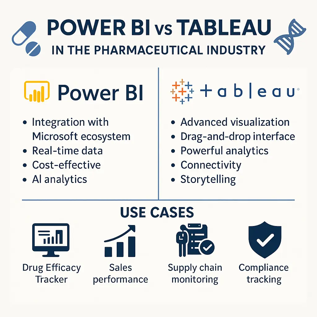
Power BI vs Tableau in Pharma: Full Comparison
Comprehensive comparison of Power BI and Tableau for pharma: features, pricing, compliance, and use cases for IT and analytics teams.

Oracle's Impact in Life Sciences: Empowering Pharmaceutical IT
Comprehensive overview of Oracle's role in the pharmaceutical industry, covering their Health Sciences solutions, cloud infrastructure, compliance features, and case studies of successful implementations at major pharma companies.
Computer Vision in Pharmaceutical Quality Control: Enhancing Drug Manufacturing
Comprehensive overview of how computer vision technologies are revolutionizing pharmaceutical quality control processes, from tablet inspection to packaging verification, with real-world implementation examples and ROI analysis.